What I Designed Today: a YouTube Thumbnail + Social Media Post Graphic

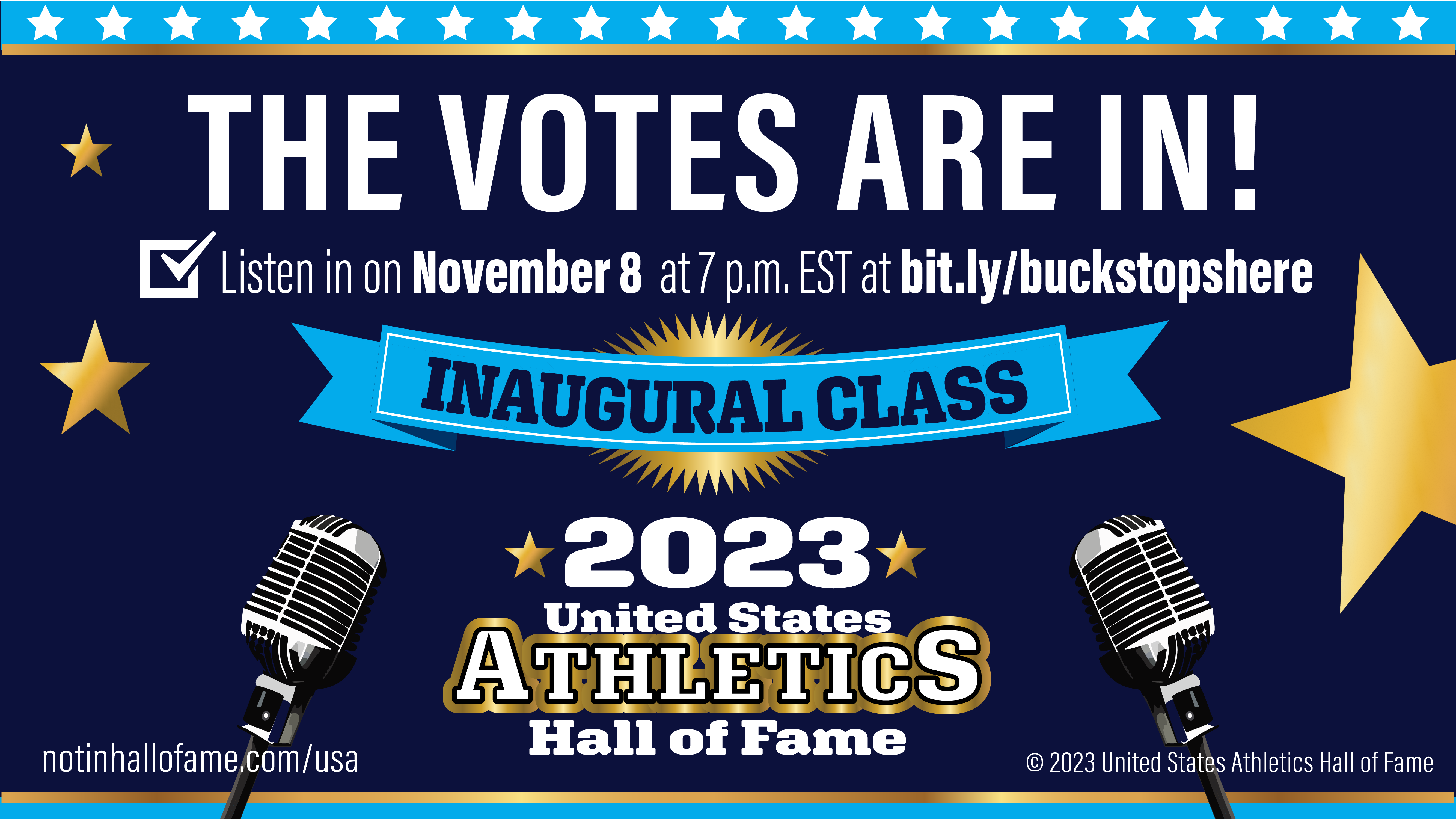
The image below is a thumbnail cover image for an upcoming live podcast by sports commentators who I’ve grown to admire recently as I’ve helped them with their social media. The sports industry is new for me and I’m learning and making connections with sports journalists and reporters — they’re a fun crew! If you like to talk sports, give The Buck Stops Here a listen. They’ll be announcing their trademarked United States Athletics Hall of Fame inaugural class this week! Details on the image.

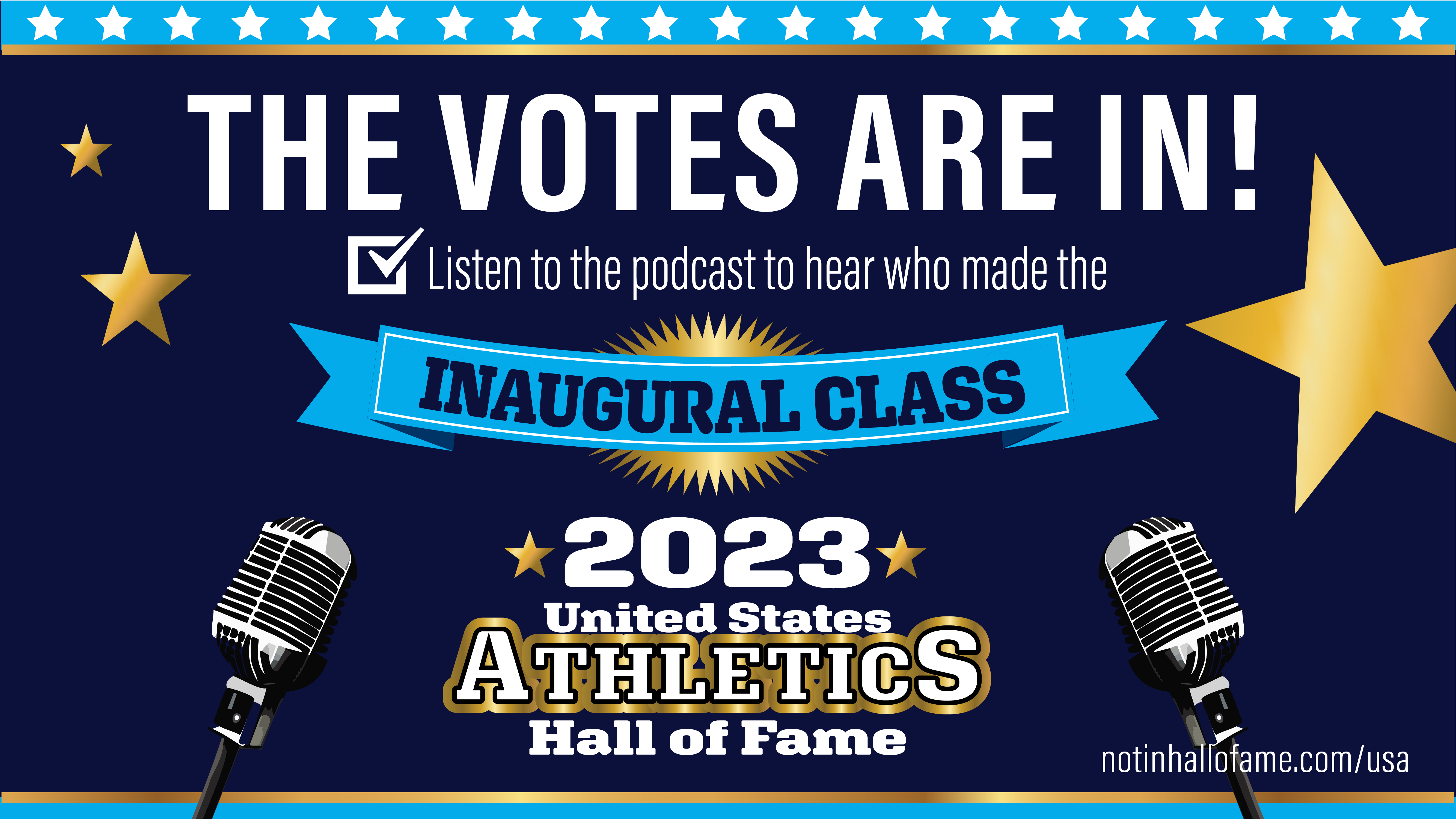
The image below will be slightly adjusted further to optimize size and resolution for Facebook, Twitter, and LinkedIn. if you’re interested, I’ll be the podcast LIVE on their TikTok channel as well. Join us!

What I Designed Today: Interchangeable B&W Newspaper Ads

So, these are quite simple but since they’re only 2″ wide and they pack a lot of info, it is important to make them readable but still stand out on the entire huge newspaper print page full of black and white!  Enter the diagonally cropped picture.  It really works!  It adds just enough visual “movement” to help the ad stand out on the static page and draw the eye of the reader.  Take a look and see which is your favorite.  These 8 ads are being printed in a series in the Bartlesville Examiner-Enterprise newspaper, based on which performer is coming up next chronologically.

set1set2set3


What I Designed Today: Redesigned Newspaper Ads for OK Mozart

So our local newspaper is notorious for poorly printed ads. It seems OK Mozart gets the brunt of the poorly printed ads — even though they’ve checked and asked for proofs which always turn out fine! Black only can be so tricky. The grays look so washed out and since most of OK Mozart’s ads are black-intensive (using Rich Black in 4/c), I had to redesign some newspaper versions of their ads to hopefully boost contrast and not worry as much about printing striations. Frustrating! Anyway, here are some of the redesigns.

eeprogressnewFINAL2

eeprogressnew2

What I Designed Today: NMDEA Black & White Program Ads

I’ve been doing reincarnations of this black and white ad for years. This year, my client decided to bump up the size to a full page. The sponsors are probably so relieved to have their name in readable-sized print! Lovely client. I wish all of my clients were as prepared and easy to work with as this one. I’m not sure which one they’ll choose but I’m sure whichever it is, it’ll stand out in the program!

NMDEA20154

NMDEA20153

NMDEA20152

NMDEA20151

What I Designed Today: the Basics of Designing Effective, Simple Black & White Ads

Nebraska Music Dealers & Exhibitors Association – NMDEA Ads

In 2006, a good friend asked me to redo the NMDEA black and white ad that had been running at their annual convention. It was a quick job so I agreed. I have now been doing their annual ad since 2006 and through two long distance moves! She approached me again this Spring for the 2012 ad and I thought it would be a good time to compile and compare past versions before I make something new. Sometimes I find an effective black and white or grayscale ad is much, much more difficult than a full color one. You have to really try to stand out from the crowd! My favorite was 2011, with the Nebraska outline used in the center. It’s funny how I can see a definite progression over the years to a better design – something I hadn’t noticed until they were side-by-side. Thanks to my friend, Marilyn, for the annual one-color challenge.

NMDEA-2011

NMDEA-2009

NMDEA-2007

NMDEA-2006