What I Designed Today: Print Shop Docs with Horrible Fonts

I’m loving the interesting flow of work coming from Bartlesville’s local print shop.  There is, however, the problem of recreating things to print EXACTLY as a client requests — but that is ugly as all get-out.  It nearly killed me the other day to save a print-ready file using the Hobo font.  The project here called for Rage Italic and a graphic with lines that I absolutely do not understand (It’s so abstract, it could mean anything!).  Kill me now.  But, such is the life of a print shop — the client’s requests always come first!  And if you are the client and you happen to read this:  take it from an experienced designer — it’s time for an update on your logo and materials. You don’t even have to hire me.  Just, for the love of all that’s holy, refresh your brand.

Exhibit A:  Rage Italic in all its horrific 1980s glory — letterhead and envelopes.  Because a small town rec center is nothing if not thorough.

LETTERHEADCOFFEYVILLEREC1outlinesweb

coffeyvillerecenvelope1outlinesweb

What I Designed Today: Bartlesville’s 2 Plus 1 Show Concert Poster

lawsonposter2There’s a great little print shop here in Bartlesville, aptly named Bartlesville Print Shop.  The owner is a smart man.  He hired a talented young girl who is his right-hand-woman most days.  The girl is on a sabbatical for school or something (I forget; let’s face it, I can barely keep track of my own life) and even though I swore off taking additional work for the summer, I decided I could spare a month or so and help out the print shop on an as-needed, contract basis.  It’s kind of fun having a print shop as a client — which is actually a first for me.  It’s a never-ending stream of varied work!  It definitely keeps me on my toes.  This poster was designed a few days ago and by the next time I stopped into the shop, he had them printed and ready to go — such a great printer.  Seriously, if you don’t have a favorite local printer like ours in Bartlesville, go find one!  A good printer makes ALL the difference…

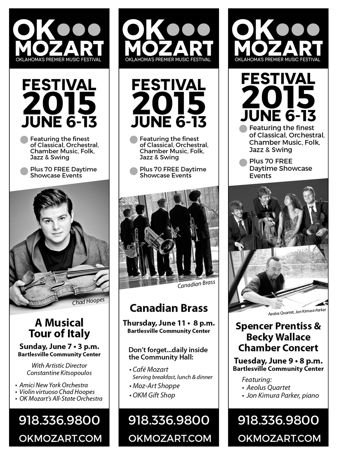
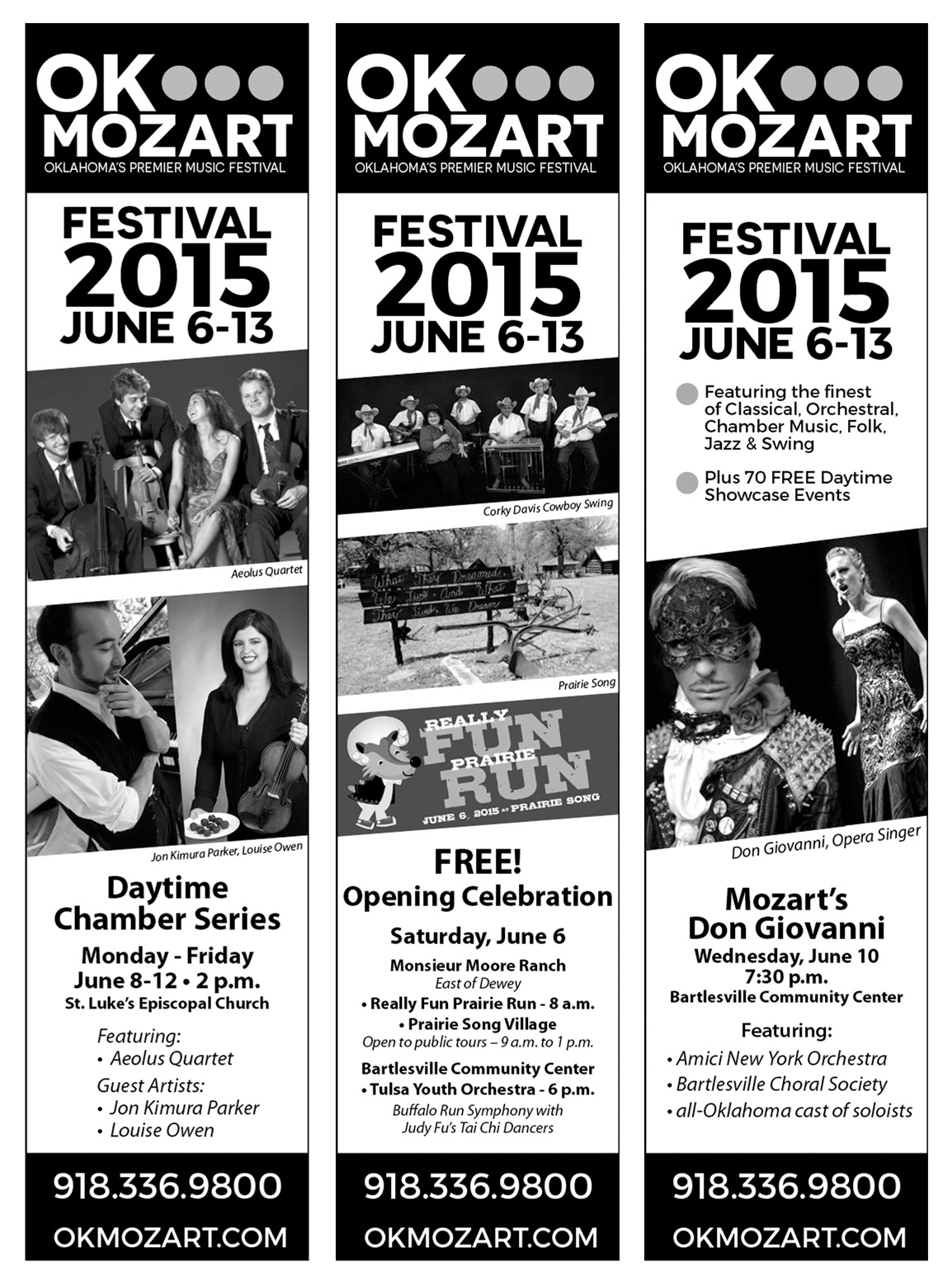
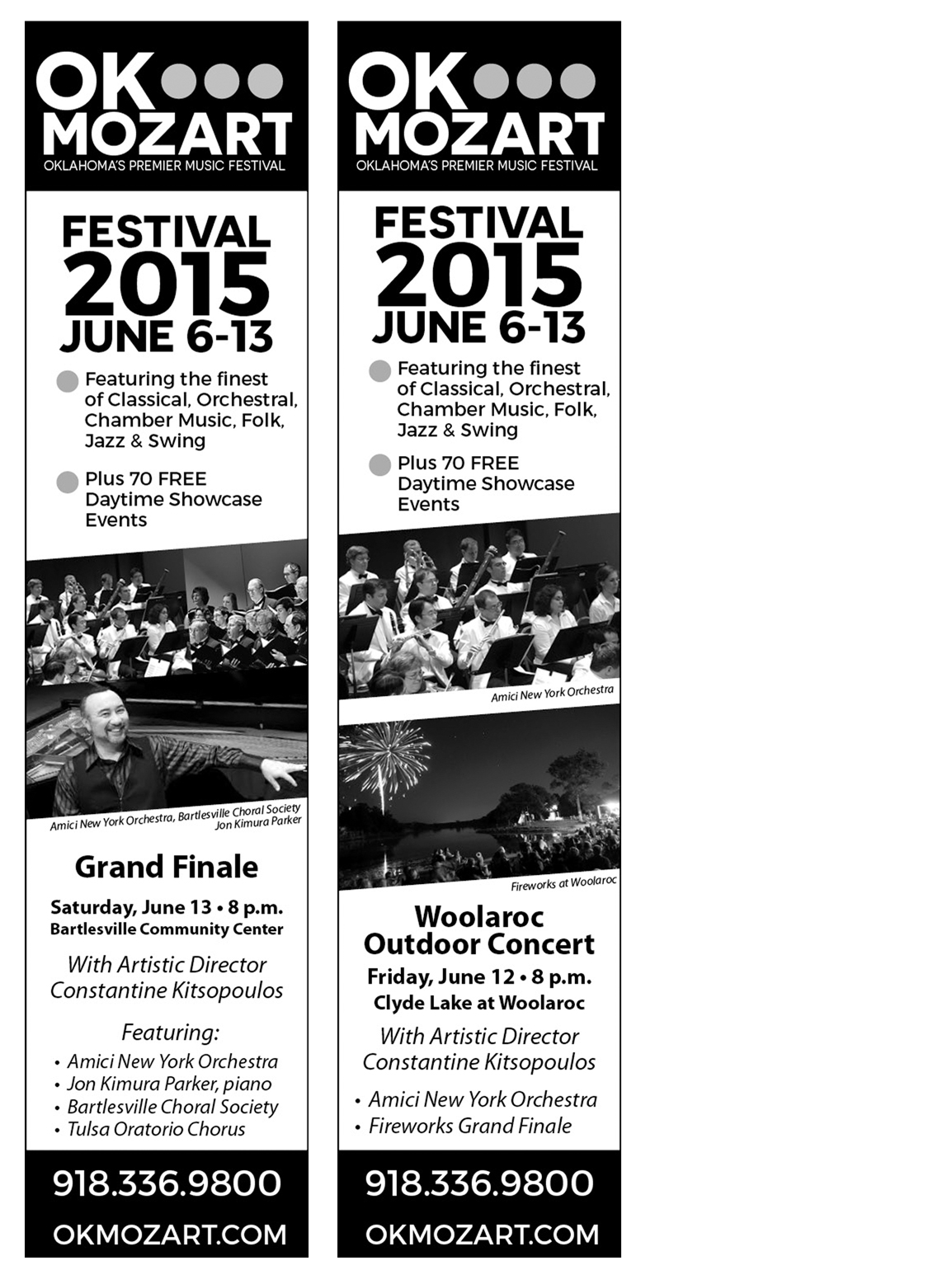
What I Designed Today: Interchangeable B&W Newspaper Ads

So, these are quite simple but since they’re only 2″ wide and they pack a lot of info, it is important to make them readable but still stand out on the entire huge newspaper print page full of black and white!  Enter the diagonally cropped picture.  It really works!  It adds just enough visual “movement” to help the ad stand out on the static page and draw the eye of the reader.  Take a look and see which is your favorite.  These 8 ads are being printed in a series in the Bartlesville Examiner-Enterprise newspaper, based on which performer is coming up next chronologically.

set1set2set3