What I Designed Today: Billboards for Adam & Kizzie at OK Mozart’s Ambler Hall

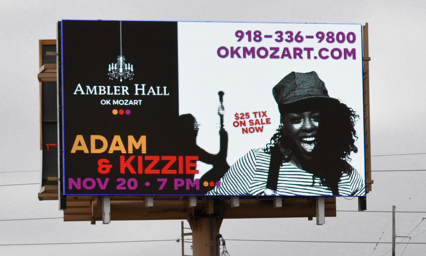
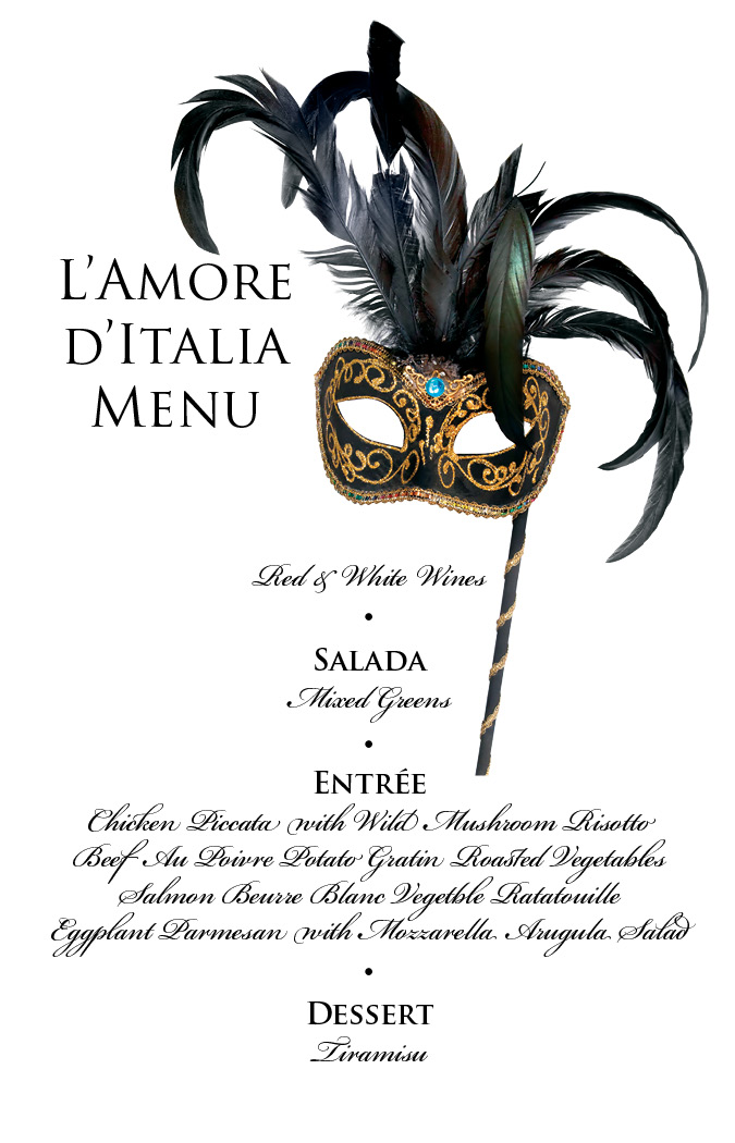
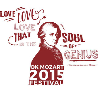
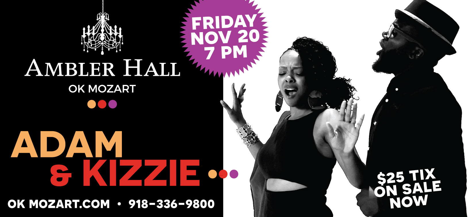
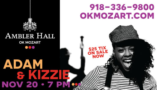
Adam & Kizzie are coming to Bartlesville and it’s going to be a fantastic night of music at OK Mozart’s Ambler Hall.  This is a new direction for OK Mozart’s music selection and this duo with their gospel, blues, rock-n-roll and jazz sound are sure to please.  I can’t wait to hear how they sound in Ambler Hall.  If you’re local, info & tix are at okmozart.com.

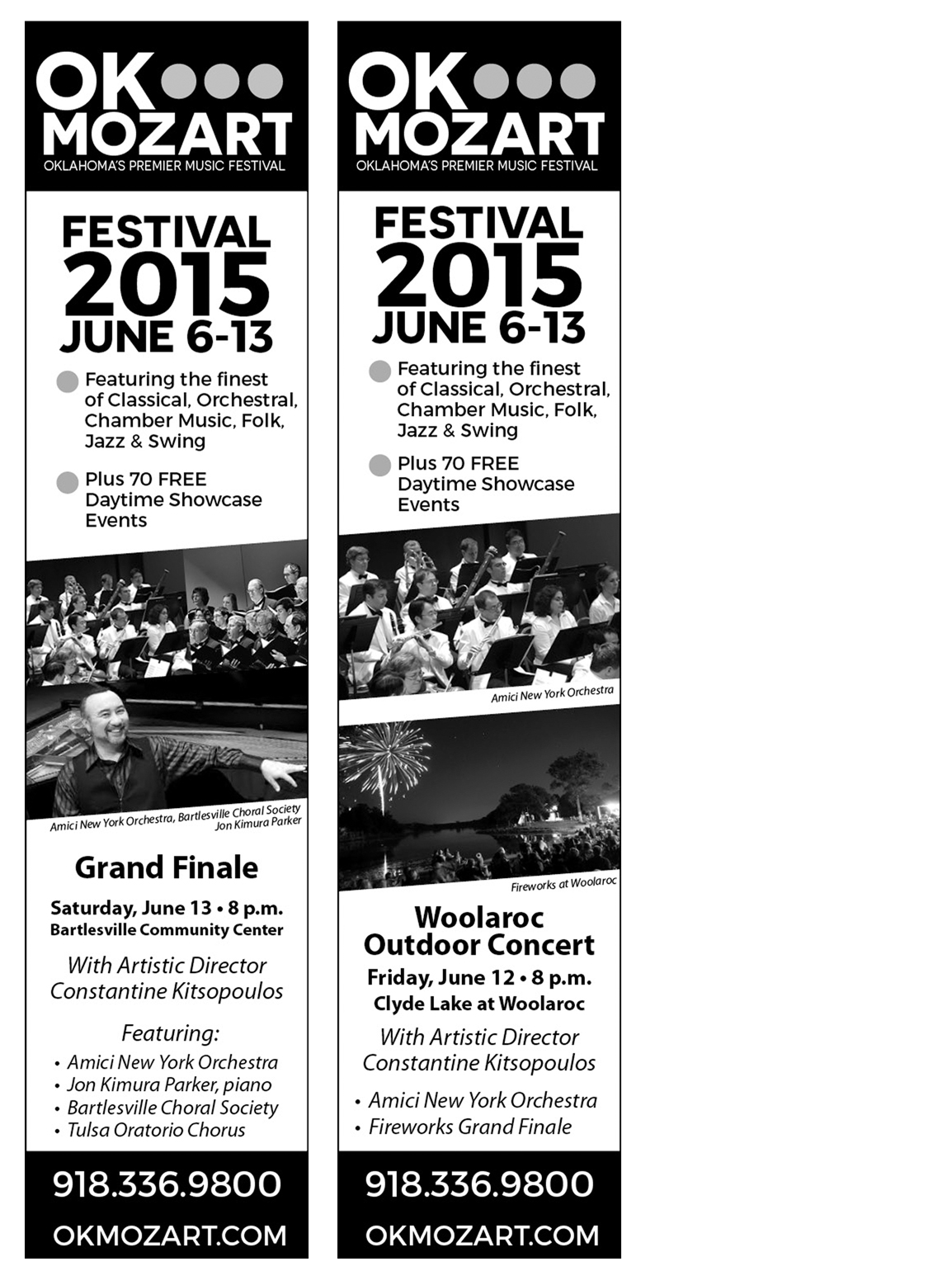
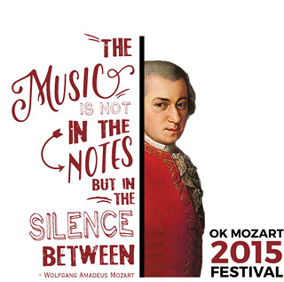
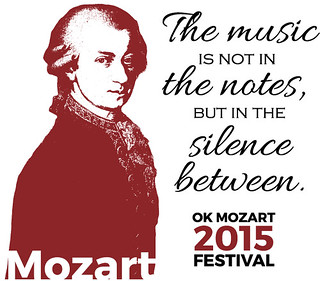
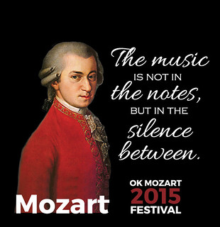
Technically I designed these billboards a little over two weeks ago.  The traditional billboard goes up tomorrow and I hope to add a shot of that from the street as well.

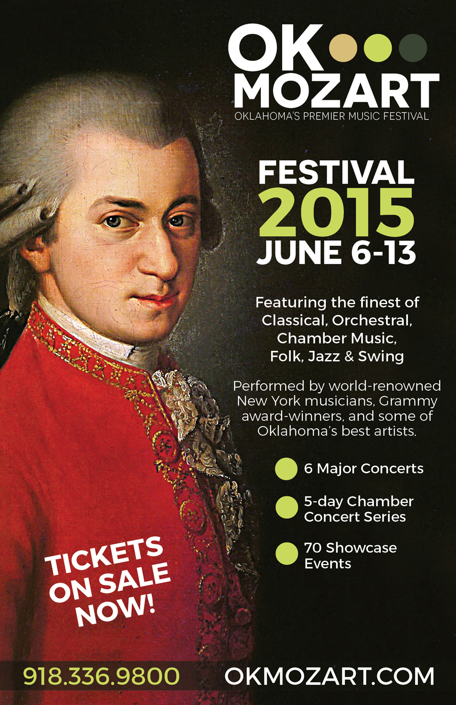
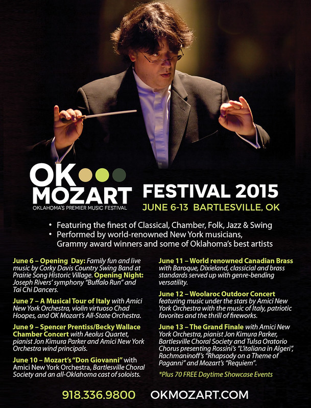
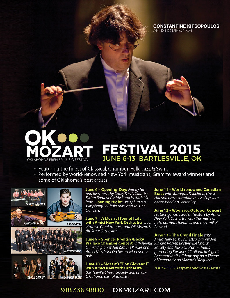
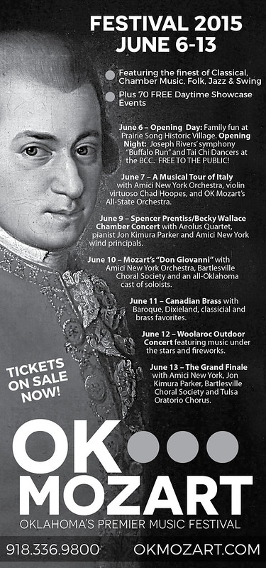
Traditional billboard

adamandkizziekeleherfinal

Digital billboard

adamandkizziedigital1

Digital billboard from the street

digitalbillboard

What I Designed Today: Logo Guide for Bartlesville’s Ambler Hall

It’s not a full-on style guide but it’s a step in the right direction with a usage guide for the most common scenarios for a logo.  I’m so excited about some of the concerts coming up at Ambler Hall!  Check out Adam & Kizzie — they’re coming in November.  For more details, visit OK Mozart on the web.

logoguide1logoguide2

What I Designed Today: L’Amore D’Italia Program for OK Mozart

The program for OK Mozart’s L’Amore d’Italia Ball is a smaller, 4-page, 1-fold piece.  I love the interior and it printed nicely on a heavy linen stock thanks to Bartlesville’s best print shop.  It turned out just lovely!  Osage Casinos sponsored the event and the mask picure on the cover was taken by local artist Gary Gibson.

amoreprogram1WEB amoreprogram1WEB2 amoreprogram1WEB3 amoreprogram1WEB4

What I Designed Today: Interchangeable B&W Newspaper Ads

So, these are quite simple but since they’re only 2″ wide and they pack a lot of info, it is important to make them readable but still stand out on the entire huge newspaper print page full of black and white!  Enter the diagonally cropped picture.  It really works!  It adds just enough visual “movement” to help the ad stand out on the static page and draw the eye of the reader.  Take a look and see which is your favorite.  These 8 ads are being printed in a series in the Bartlesville Examiner-Enterprise newspaper, based on which performer is coming up next chronologically.

set1set2set3


What I Designed Today: OK Mozart Kids’ Events Poster & T-Shirt

These are similar to the Fun Run poster and t-shirt because it should have the same look but be independent. The Fun Run T-Shirt is going to be printed on sapphire blue so the t-shirt I’m suggesting here is to be printed on neon yellow. If it’s not in the budget this year, perhaps next. Bright colors are so much fun for t-shirts, especially for kids!

Poster design:

kidseventsposter

T-Shirt design:

kidsfestivalteeneon

What I Designed Today: OK Mozart International Music Festival T-Shirts

I submitted about 9 different designs and these are my favorite versions.  The local printer prefers one color, so I was challenged to do an eye catching design while only using one or two colors to keep costs low.  Mission accomplished!  Which design would you prefer?  Do you think Mozart actually said these quotes?  Logo front pocket, this design printed large on the back side of the t-shirt design.

festivaltee1

lovelovelovegenius

mozartmusicquote3

festivaltee2

In the end, in a somewhat heated debate, my client chose to print two different designs — each of which was liked by different personnel who adamantly did not like the other design!  Which makes me think of the phrase, “If everybody likes what you’re doing, you’re doing something wrong!” Not a bad motto to live by! I’m curious, though, which of the two below would you choose?

festivaltee1  

1red

What I Designed Today: 2015 OK Mozart Festival Poster

thumbnailgenfestivalposterfinalWEB

What I Designed Today (ahem, last week): OK Mozart A Really Fun Prairie Run Event Poster

I really need to do better at publishing daily so I don’t have to keep backtracking!  But I’ve been working way too much and there’s no way I can post it all.  That’s good, right?!

thumbnailfunrunfinal


What I Designed Today: 2015 OK Mozart L’Amore d’Italia Ball Invitation & RSVP Card

amoreinvitation1web amoreinvitation1web2 amorersvp1web

What I Designed Today: Redesigned Newspaper Ads for OK Mozart

So our local newspaper is notorious for poorly printed ads. It seems OK Mozart gets the brunt of the poorly printed ads — even though they’ve checked and asked for proofs which always turn out fine! Black only can be so tricky. The grays look so washed out and since most of OK Mozart’s ads are black-intensive (using Rich Black in 4/c), I had to redesign some newspaper versions of their ads to hopefully boost contrast and not worry as much about printing striations. Frustrating! Anyway, here are some of the redesigns.

eeprogressnewFINAL2

eeprogressnew2

What I Designed Today: Ad Revisions for OK Mozart

So one of my very favoritest sources of income is revising previously created ads in different sizes for different publications. It takes time, but you just have to adjust things without re-creating the wheel, so to speak. It probably takes more time than my client would think it does but it’s relatively painless and a good source of income — I want to say residual income but that’s not entirely correct because I’m still eating up the clock and sitting at the computer. They’re worth it even though I generally charge quite a bit less for them. These ads were for GTR Newspapers, an independent free papers association for Tulsa, Oklahoma Magazine, and Tulsa’s Currentland publication.

okmag1

currentlandmag1

GTRTulsa2

What I Designed Today: Table Card for Bartlesville’s OK Mozart

This table card is part of the March Madness set for OK Mozart’s upcoming event in Bartlesville.  If you’re in the area, take a look at the lovely food and auction items — it will be a wonderful event!

tablecard5withbleed2

smtablecard6withbleed

What I Designed Today: OK Mozart Ads

One is a grayscale ad for newsprint and the second is a recreation of their ad in Conde Nast, originally done by PDG Creative, with the proper fonts of this year’s campaign and a little bit of a changeup in placement if items and photos (at OK Mozart’s request). It was a good work day, busy but not TOO stressful!

conderecreated1

eebwprogress2

What I Designed Today: Tri-Fold Brochure

Tri-fold brochures are the bread and butter of marketing, aside from business cards. They give you a chance to show and tell what your business is about. Designs that flow well are few and far between but I like how this one turned out. The only thing I would add or change now are calla lily leaves following the curved divider or at the top right hand corner of the circles. Can’t wait to see this one in print!

grouptourbrochure8finalB

grouptourbrochure8final