Yes, I spelled “theater” both ways — the intentional “error” will increase engagement and better the SEO results for my Google search terms, so it’s a win-win for everyone except old-style grammar afficionados and most English teachers. As unofficial president of the Sharpie Enthusiasts Club, I apologize and encourage fixing the error with a Sharpie.
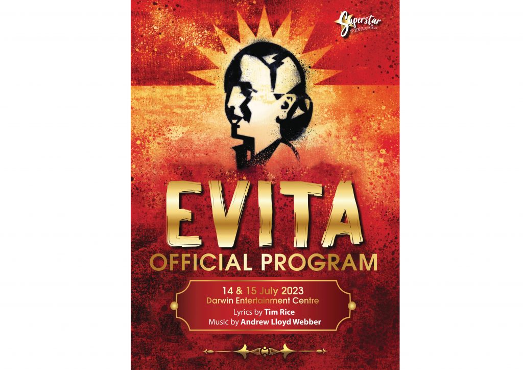
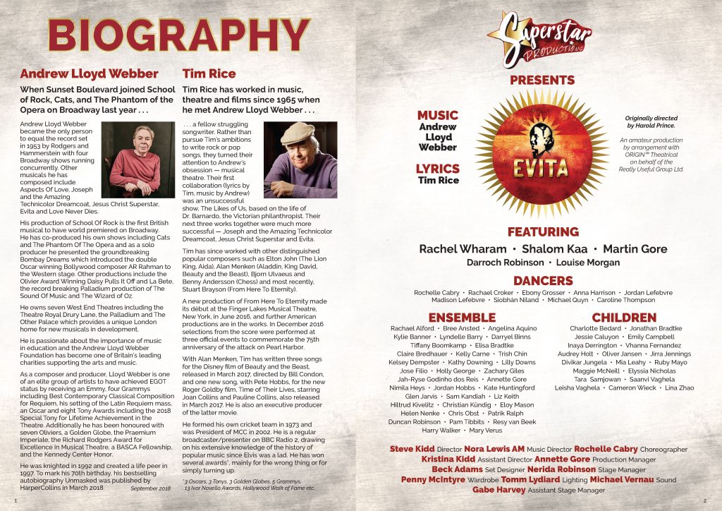
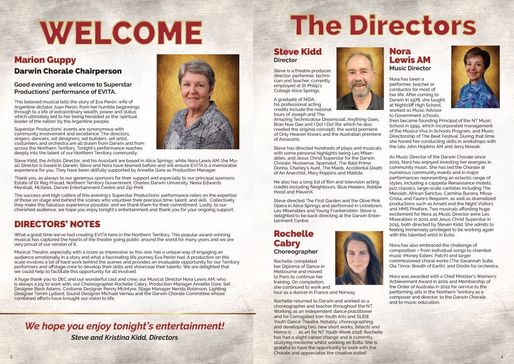
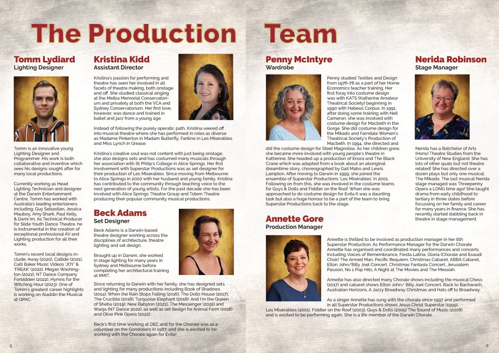
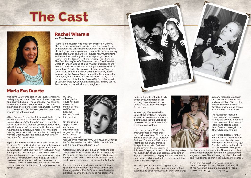
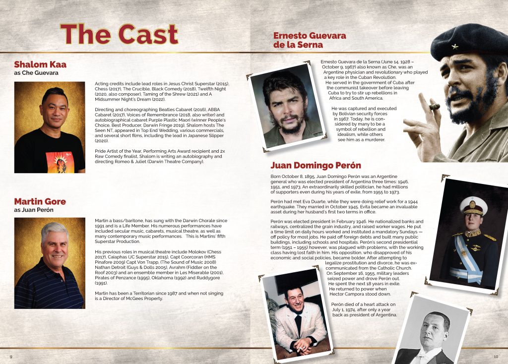
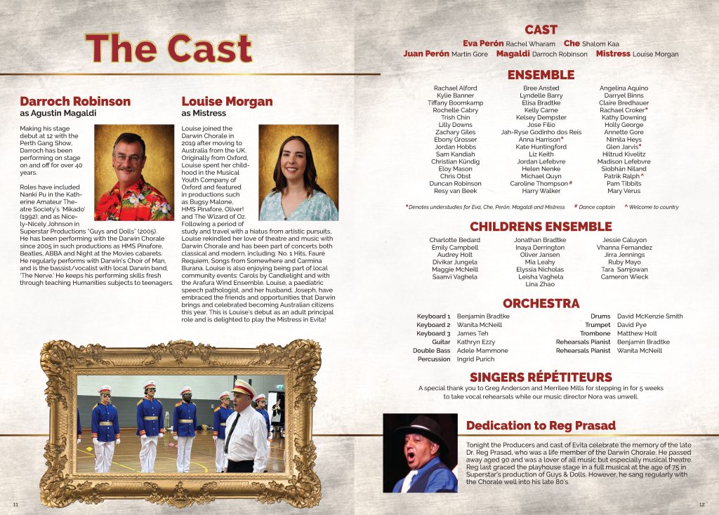
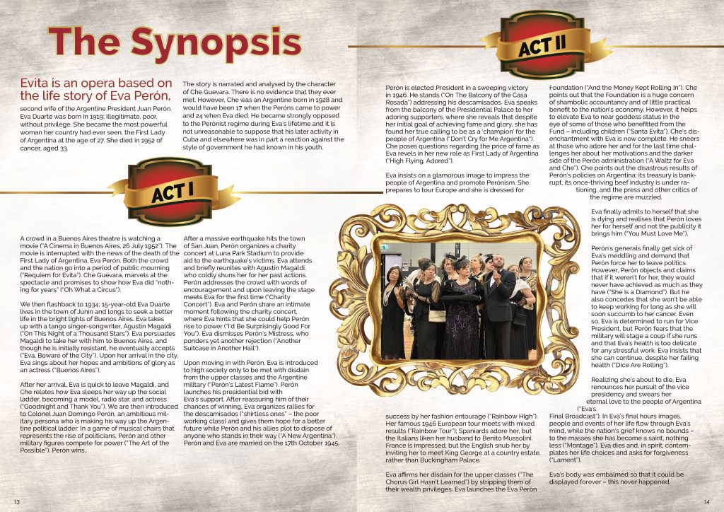
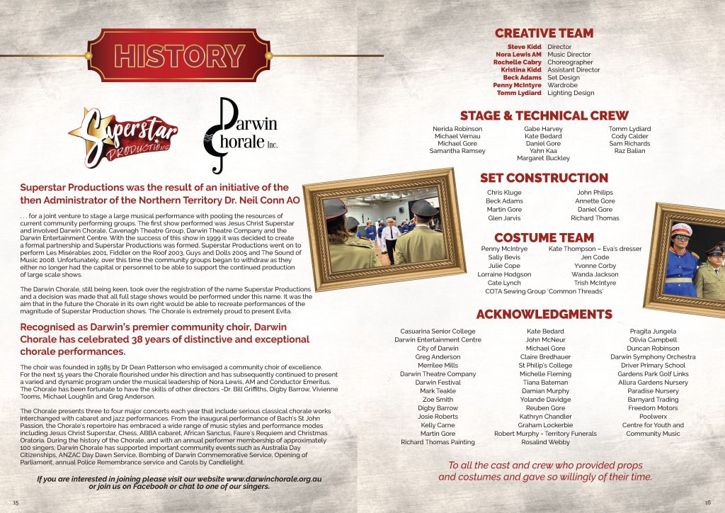
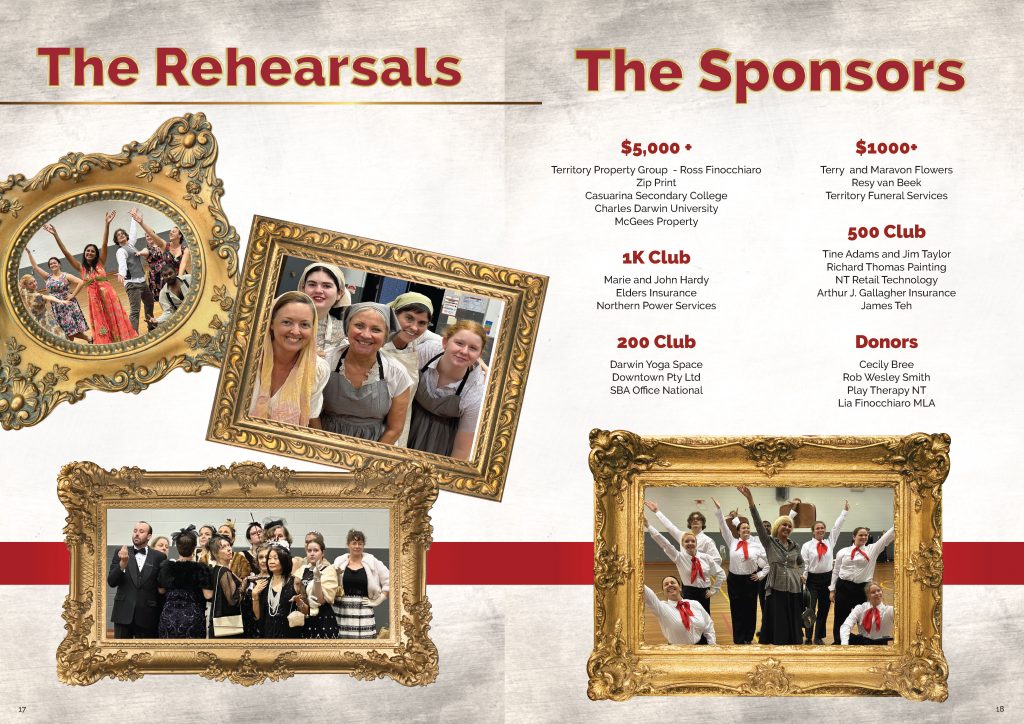
This program was actually designed in very early July on a rush basis because the original print layout person became ill. It’s been a few years since I designed anything for the theater, so it took longer than usual, but was fun to try and match the original cover style the original designer had created. I loved the custom gilt frames and golden photo backdrop I was able to bring to the interior — particularly the spreads for the major roles. It’s been a long time since I designed anything and felt like riding a bike after many years. The speed will come back as soon as I get familiar with the upgrades to the tools I used to use and some fantastic new ones that have surfaced in the last 6 years!
The show had all sold out performances — CONGRATS to Superstar Productions and the Darwin Theater in Darwin, Northern Territory, Australia!

