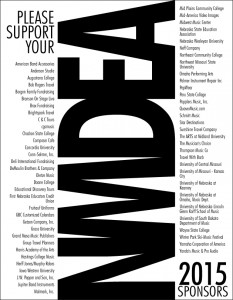
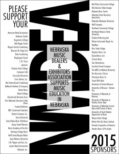
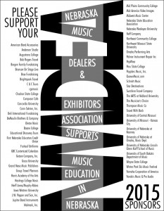
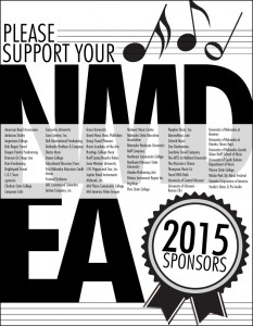
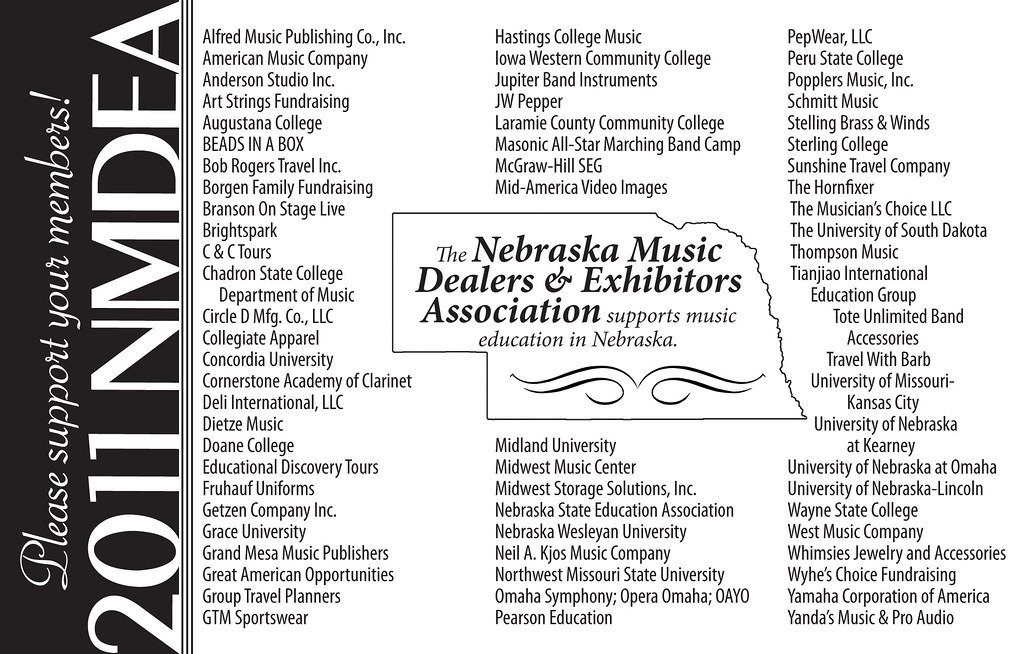
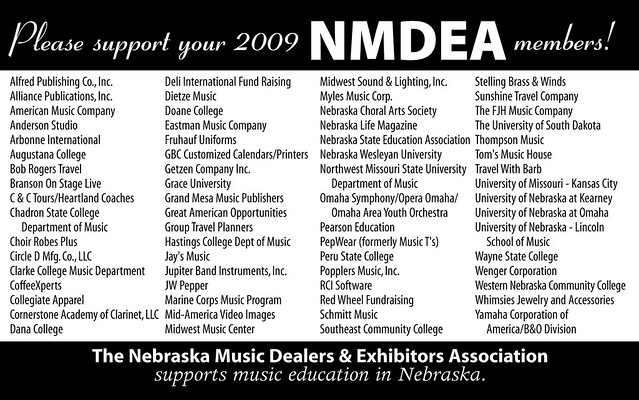
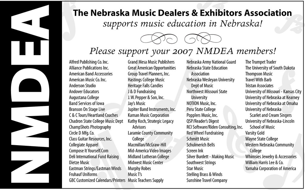
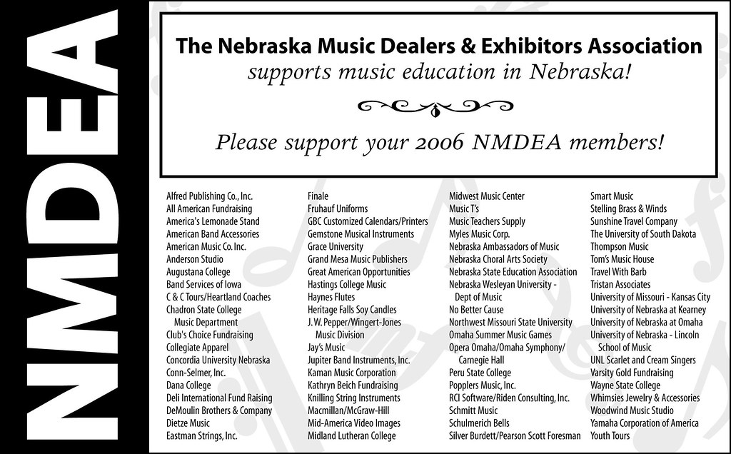
I’ve been doing reincarnations of this black and white ad for years. This year, my client decided to bump up the size to a full page. The sponsors are probably so relieved to have their name in readable-sized print! Lovely client. I wish all of my clients were as prepared and easy to work with as this one. I’m not sure which one they’ll choose but I’m sure whichever it is, it’ll stand out in the program!
Tag Archives: NMDEA
What I Designed Today: the Basics of Designing Effective, Simple Black & White Ads
Nebraska Music Dealers & Exhibitors Association – NMDEA Ads
In 2006, a good friend asked me to redo the NMDEA black and white ad that had been running at their annual convention. It was a quick job so I agreed. I have now been doing their annual ad since 2006 and through two long distance moves! She approached me again this Spring for the 2012 ad and I thought it would be a good time to compile and compare past versions before I make something new. Sometimes I find an effective black and white or grayscale ad is much, much more difficult than a full color one. You have to really try to stand out from the crowd! My favorite was 2011, with the Nebraska outline used in the center. It’s funny how I can see a definite progression over the years to a better design – something I hadn’t noticed until they were side-by-side. Thanks to my friend, Marilyn, for the annual one-color challenge.

