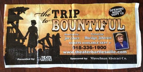
What I Designed Today: Theater Bartlesville’s The Trip to Bountiful – Billboard Design Progression

tttbproof

tttb

tttbprogression

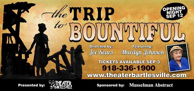
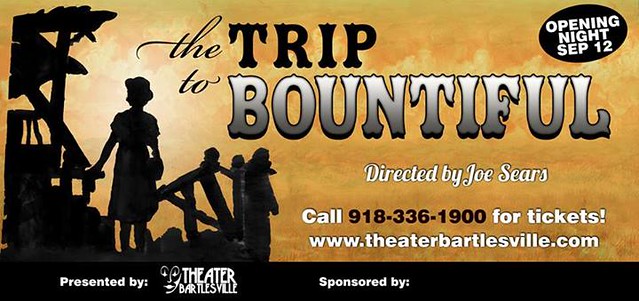
I thought you might like to see the progression of this particular billboard. The artistic director, Joe Sears, of Greater Tuna fame (Aunt Pearl? Tony nominee? Ring any bells?), created the yellow background and silhouette with watercolors on vellum and I scanned the artwork in and adjusted everything for print. It’s been 20 years since I designed a billboard. That makes me sound really, really old but the first time I did one, I was only 22. You do the math. I’m not a dinosaur…yet. Billboard design can be tricky but it’s nice to know the technology has improved enough to where an accurate color proof is available on the same vinyl they use to put up on the actual billboard. It was only $35 extra for the proof, and yellow can also be tricky, so I figured it was worth it. If all went well, we’d have an extra 2.5 x 4′ banner for the front window of the theater. The yellow turned out fine so it was a win, win!

In other news, I’ve been elected Marketing Director for the local community theater: Theater Bartlesville. It’s going to be a fun way for me to make more local connections in the printing and publishing industry, as well as the arts. It’s a great board this year so I’ve already met some fantastic, intelligent, kind people. This won’t kill me for a year term, right?!

What I Designed Today: Climbing Logo

compiled

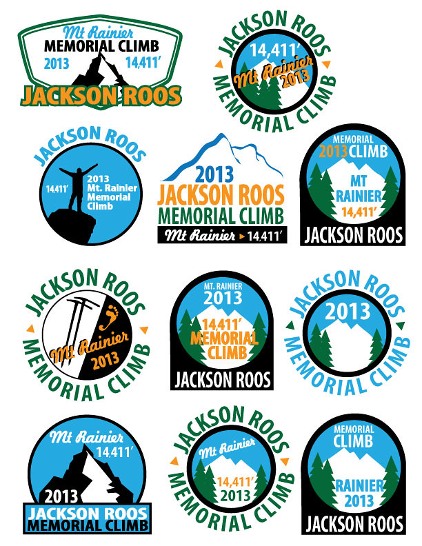
Here’s what I did today:  which would you choose?

(Not So) Recent Design Work: Pisgah Centennial Celebration Poster

poster11x17b

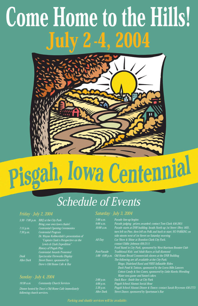
In an effort to get some of my older work online, here’s a piece from a 2004 Centennial Celebration in the town of Pisgah, Iowa. Great little town! This particular poster won a Silver Award from the Printing Industry of the Midlands. The printer submitted it without my knowledge and it won! He said that he submitted it after he saw several employees at the printing house put it up in their cubicles just because they liked it. Those crazy midwesterners that I adore!

Crocheted Elephant Amigurumi (My First Crochet Project)

DSC_0089

DSC_0026

elephant3

elephant1

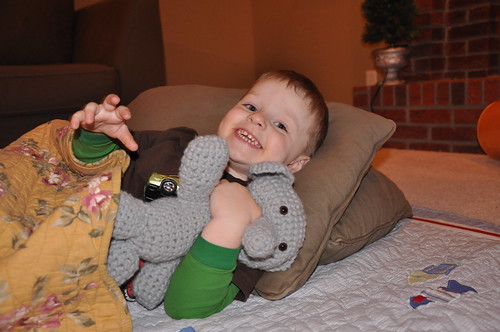
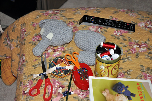
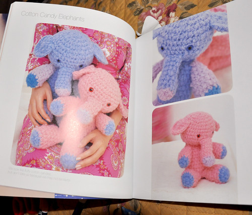
So way back in late 2008, I created my very first crocheted project: an elephant. The elephant is from Kyuuto! Japanese Crafts Amigurumi by Tomoko Takamori. I didn’t want to bother with switching colors since I was such a newbie and I think he turned out pretty cute anyway! The boys have loved him and he has survived two moves since then. Mostly I get a little teary-eyed at how much Ben looks like a baby then (unfortunately, we still baby him now – consequences of him being our last, I suppose!). It seems to me, in hindsight, I had my act together back then…what happened? Can I blame my current bout of flakiness and lack of energy on two moves. Why, yes, I think I can!

What I Designed Today: Kara’s Party Ideas

indian-9c-682x1024

girl-indian-invite-half-horizontal

IMG_0960

IMG_0959

IMG_0961

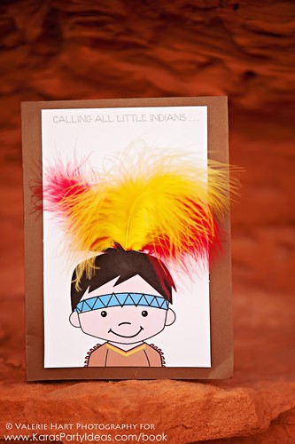
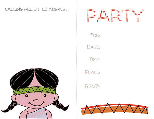
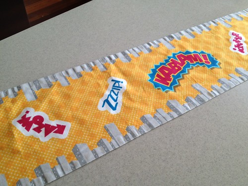
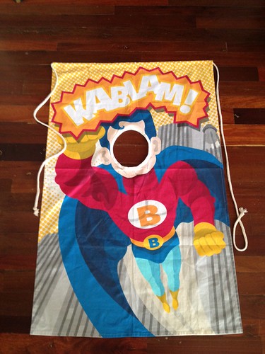
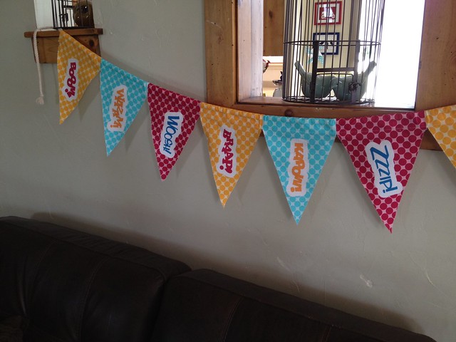
I’ve been keeping this part under wraps for a bit but I think it’s safe to show you some of the work I’ve been coordinating and creating for Kara’s Party Ideas. Party goods are so. much. fun. to create compared to my more business-oriented clients like dermatology and politics! Check her site out: she is so the next Martha Stewart except she’s much more beautiful (inside and out)! Kara just launched sales of party goods on her site and I know she’s adding more so be sure and stop by Kara’s Party Ideas and you just might see something I helped design. The Superhero set is being printed in fabric and will be for sale soon! Adorable, no? Be sure to check out the Native American themed party – so cute!

What I Designed Today: the Basics of Designing Effective, Simple Black & White Ads

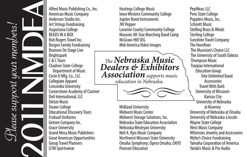
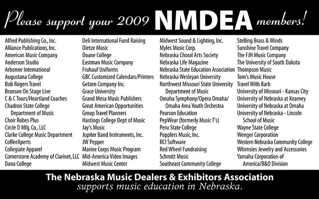
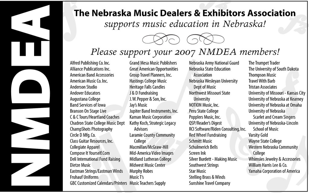
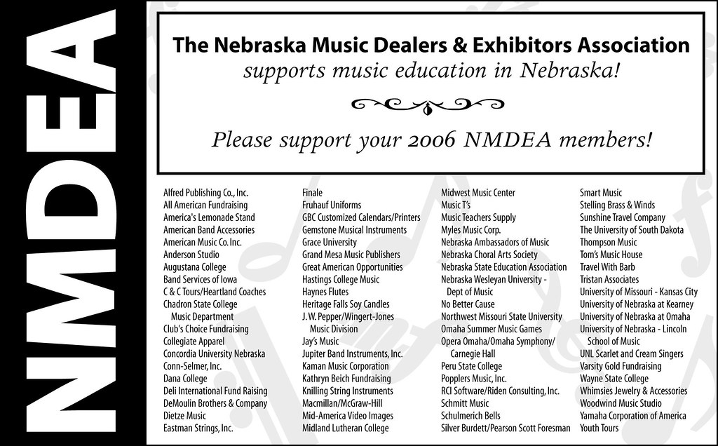
Nebraska Music Dealers & Exhibitors Association – NMDEA Ads

In 2006, a good friend asked me to redo the NMDEA black and white ad that had been running at their annual convention. It was a quick job so I agreed. I have now been doing their annual ad since 2006 and through two long distance moves! She approached me again this Spring for the 2012 ad and I thought it would be a good time to compile and compare past versions before I make something new. Sometimes I find an effective black and white or grayscale ad is much, much more difficult than a full color one. You have to really try to stand out from the crowd! My favorite was 2011, with the Nebraska outline used in the center. It’s funny how I can see a definite progression over the years to a better design – something I hadn’t noticed until they were side-by-side. Thanks to my friend, Marilyn, for the annual one-color challenge.

NMDEA-2011

NMDEA-2009

NMDEA-2007

NMDEA-2006

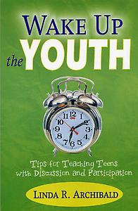
What I Designed Today: a Book Cover for Wake Up the Youth

611

Here is a book cover I did a few years ago (and finally read when I got asked to teach Old Testament to the high school sophomores this year). I highly recommend the book for anyone who teaches youth and especially love the bright green cover.

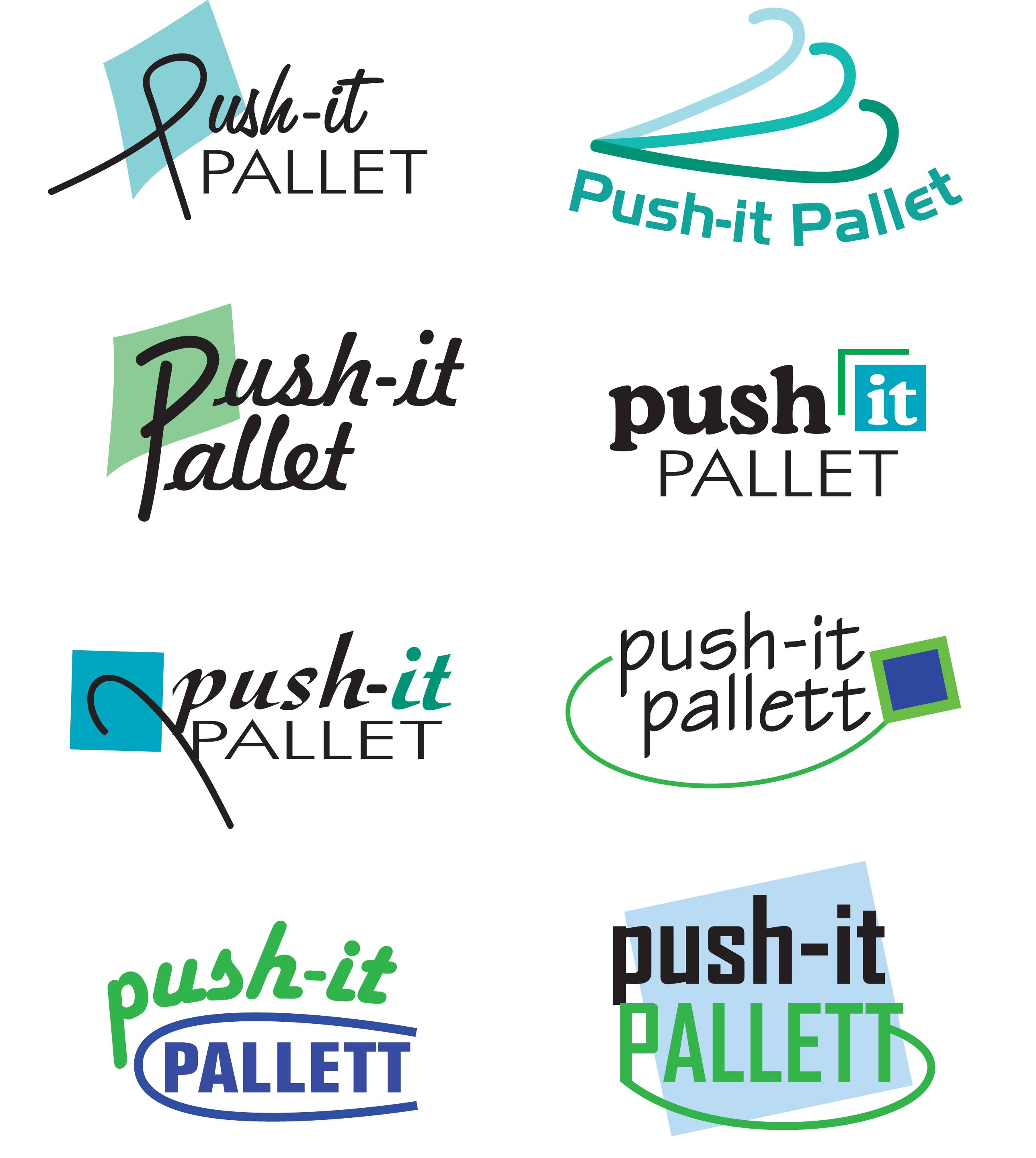
What I Designed Today: Logo Designs for Push-It Pallet

I was asked to create a logo for a company that uses padded pallets as jewelry display cases. The requirements were: blue and green colors and an arrow or “hook”. I chose to include a box to indicate more of what the company was about! I like the chosen logo because of its retro look. Here is the page of logos initially sent for review:

Here is the finished selection:

What I Designed Today: Logo Designs for Tech Learnology

Here are some quick logo samples I designed for a client in Houston. Which one is your favorite? Mine is the third from the top.

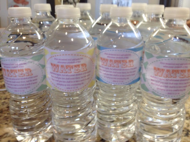
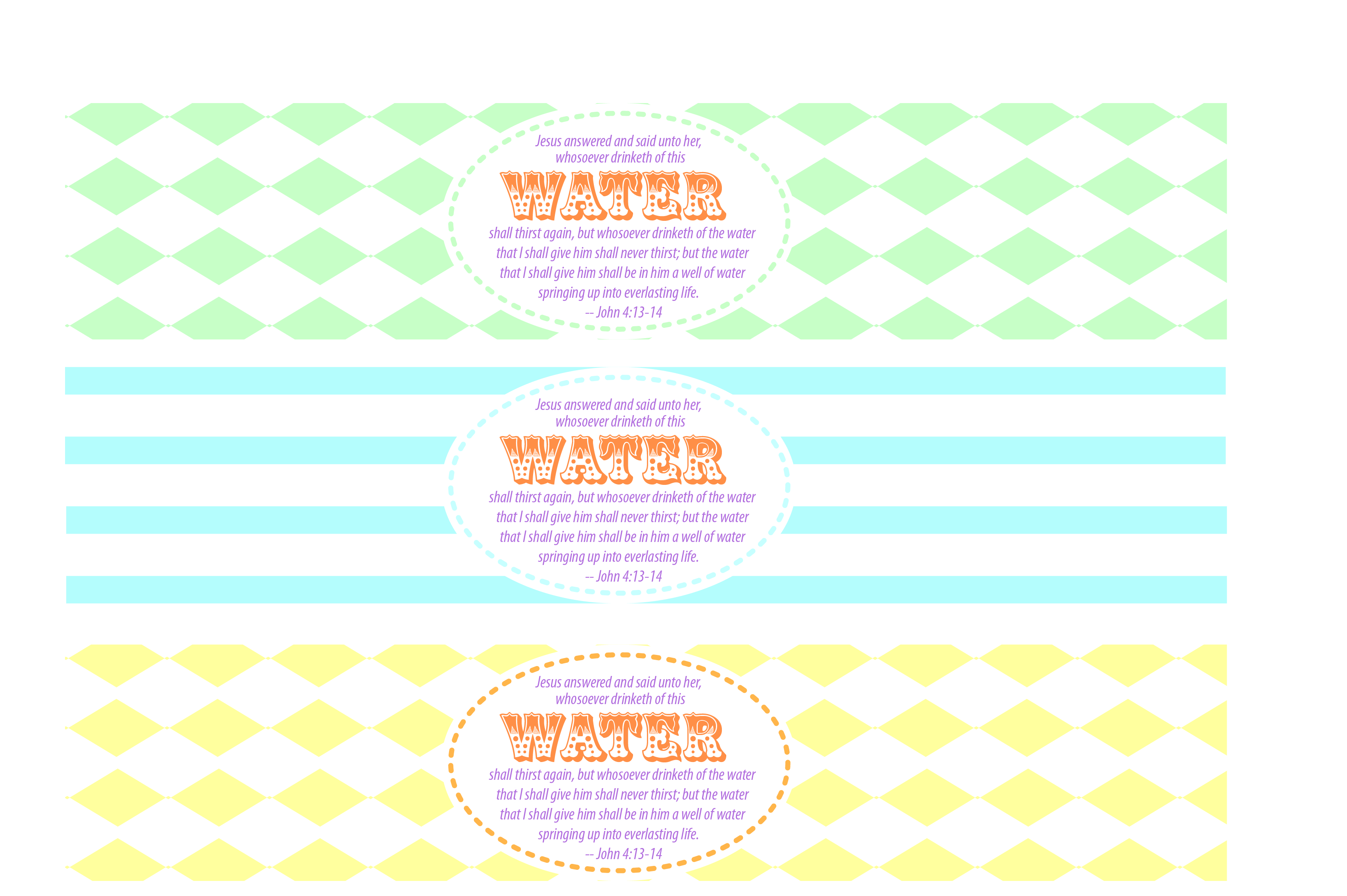
What I Designed Today: Do It Yourself Water Bottle Labels – Jesus Christ is the Living Water John 4:13-14

Print

Print

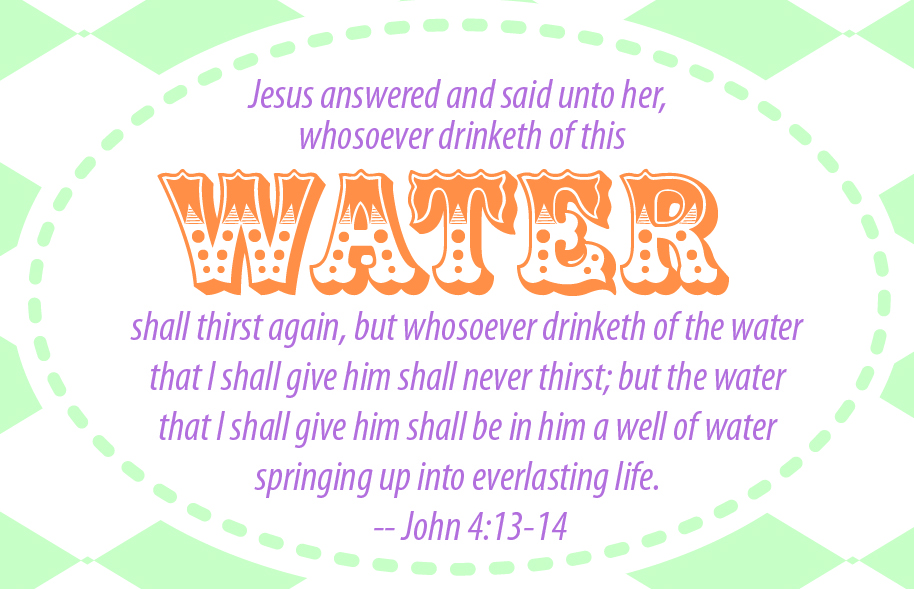
So my husband was in charge of refreshments at the youth activity this week at church and since he was helping me with a client’s custom WordPress install and website, I pitched in and helped him with the food and drink. Since I recently have been working to help a party goods designer (more announcements and info to come on that later!), I knew I could quickly throw together a water label with a fitting scripture: John 4:13-14. Free jpg file for download here. You will want to use packing tape to adhere them to the water bottle. I found the easiest way was to remove the official label off the bottle, stretch out a piece of packing tape a little longer than your new label and center it on your tape and wrap it around each bottle – voila! So cute. I think I’ll have to use this for seminary, too.

(Not So) Recent Design Work: Tradeshow Direct Mail Card for Delasco

bowfinal.PDF

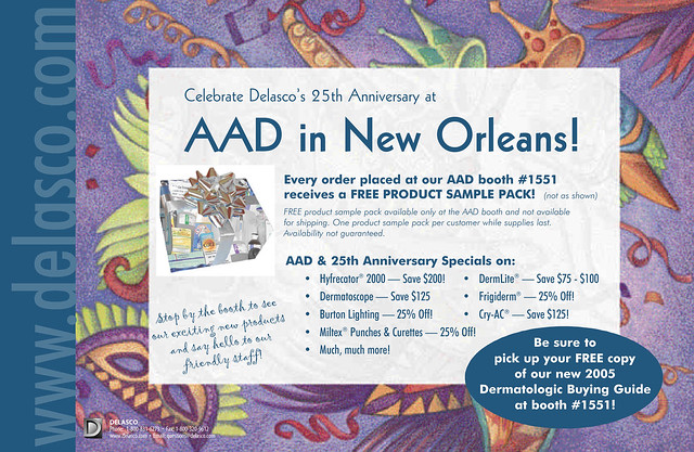
One of my freelance clients over the years has been Delasco — a fantastic company with fantastic employees. Did you know that they are the world’s largest dermatologic supplier? Not only have I done over a decade’s worth of their annual 250+ page, full-color catalog (from 1997 through 2010), I have helped them with many marketing and communications projects ranging from boxes and info sheets to forms, catalogs, ads and banners. They have been such a good client over the years that it would take hundreds – possibly thousands – of posts to show everything I’ve done for them. Some of the best moments, though, were found in developing life-long friendships with some amazing people (you know who you are!). Freelance work doesn’t have to be solitary — with clients like these, work can be uplifting and downright fun. The particular direct mailer above was used to announce their booth at an AAD meeting in New Orleans. It was a highly successful piece with a blue metallic PMS used for most of the background and the mailing side which I have yet to scan in and post.

Photography for Christmas Lights

exteriorlights2

exteriorlights1

christmastree2

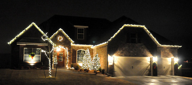
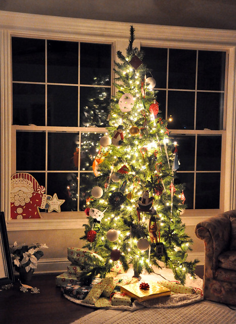
So our neighborhood is having a Christmas lights contest and, since ours is relatively tasteful, one can be assured we will not win. At any rate, I thought it would be a good time to learn how to use my Nikon D90 and get some pictures of the lights. My hubby is a very experienced photographer so he tried patiently to explain ISO and shutter speed to me. It still doesn’t quite make sense but here goes: ISO goes as high as your camera will go – I set mine at 3200. Interestingly enough, the shutter speed varied – some pictures came out good at 1/10, some at 1/8 and some at 1/25 and lastly, be sure that the camera is in manual mode and the flash is off. We found the interior tree pictures came out best if surrounding lights were turned off, too. It was fun to change the speed and see what happened. Now if I could only figure out how to get the dang camera on and off the tripod…I’m pretty much hopeless when it comes to photography! If composition were the only factor, I’d have it made.

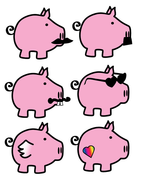
What I Designed Today: Adorable Pink Pigs

Pink Pigs

You don’t even want to know why I needed to draw pink pigs. But aren’t they cute?! Cole had a good time fixing up the ears for me. Feel free to download and use the high res jpg. If you need vector artwork for this item, check out Bigstock for vector download – it should go live in a few days.

What I Designed Today: Christmas Songs Book Cover

coverbackspinesm

So my smarty-pants friend is, among many things, very good with words. He compiled this testament of a book as a Christmas gift for friends and family and asked me to do the cover. I can’t wait to see the final product!

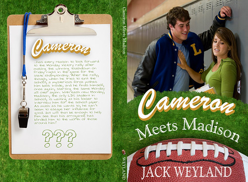
(Not So) Recent Design Work: a Book Cover for Jack Weyland’s “Cameron Meets Madison”

weylandfinalzeroagainB-sm-w

Hmph. I know that title should be italicized but I can’t find in my WordPress where it will allow you make it italic (there’s no place for HTML encoding or formatting of any kind). Oh well. Please forgive me, dear readers who might possibly care (cough, cough). I know I’m the only one who probably cares about such things considering I is (sic) an English major and all.

So I’ve decided to go back through some old work and post it on here so this blog can include more of the graphic design I’ve done over the years. Someday I’ll get that professional site up, but blogging is way more fun. Here’s a cover I did a year or two ago for Jack Weyland’s book entitled Cameron Meets Madison. The publisher had strict instructions to make it similar to his other bestselling works but I wanted it to look a bit fresher and I think it hits the mark. I have not read it — yet — but if you have, let me know your thoughts either here or on goodreads.