What I Designed Today: Billboard Artwork for “The Real Inspector Hound” for Theater Bartlesville

TRIHbillboardwithhalfinchbleed2

Final billboard.

12x18poster2cropped

Final poster.

I ran a test vote on Facebook with my 777 friends and the red poster won out over the sideways-text white one by a thin margin. We’re using the red poster with the spyglass from one of the others. Good combo. This made the billboard much easier to do!

What I Designed Today: Poster Artwork for The Real Inspector Hound for Theater Bartlesville

12x18postercropped

12x18poster2cropped

12x18poster3cropped

Theater Bartlesville’s next play is “The Real Inspector Hound”. These are my first drafts. Which would you choose?

What I Designed Today: Steam Train Tickets

Print

Print

A steam train engineer requested tickets for an upcoming birthday party for a local Steam Train No. 940. He wanted a punch card for the kids to use for the party. I love trains!

What I Designed Today: Play Titles

the-real-inspector-hound

the-fox-on-the-fairway

the-eskimos-have-landed

little-shop-of-horrors

The artwork for the next three plays at Bartlesville Theater hasn’t even been started but I needed to get the play titles in the brochure and I didn’t want plain, old, boring text, so I whipped these up as fast as I could this morning. Which is your favorite? I love Illustrator more and more each day (the more I actually learn how to use it!). I finally gave in to Adobe Illustrator CC and I am loving it.

Radio Interview for The Trip to Bountiful

DSC_0006

DSC_0005

DSC_0003
Left to right: Joe Sears, Charlie Taraboletti, Marilyn Johnson (along with Amity Hollenbaugh in the background, who really runs everything)

I arranged my first radio spot for Theater Bartlesville with Bartlesville Radio KWON — 1400 AM or 100.3 FM on the dial. I wasn’t nervous until it was OVER. I chose to sit in the back and not say anything but when the interviewer, Charlie Taraboletti, asked for dates, nobody else had them so I had to step up to the microphone. I had a frog in my throat (of course!) but I think it went well and, more importantly, I hope Bartlesville peeps will turn out for the show and buy some tickets! Many are thinking the theater will be sold out this year, so be sure to get your tickets while you can at 918-336-1900. Online ticketing at www.theaterbartlesville.com is not available but will be coming soon.

UPDATE 9/6/13: I’ve been told the radio interview is recorded and available online at Bartlesville Radio! Hallelujah! We can all bask in my frog-in-the-throat moment. Oh, well, at least Marilyn and Joe sound great!

What I Designed Today: Theater Bartlesville’s The Trip to Bountiful – Billboard Design Progression

tttbproof

tttb

tttbprogression

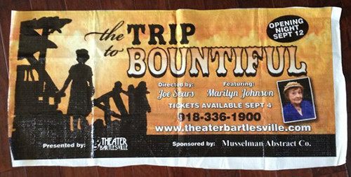
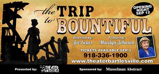
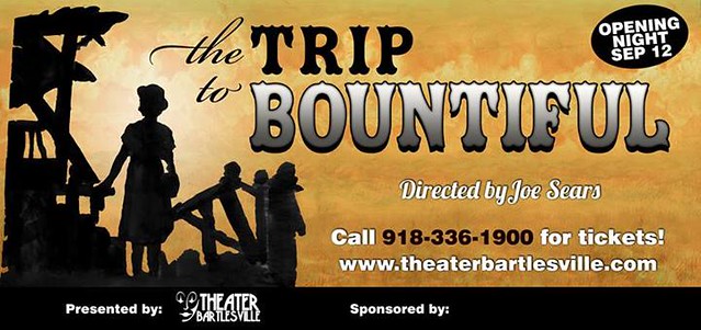
I thought you might like to see the progression of this particular billboard. The artistic director, Joe Sears, of Greater Tuna fame (Aunt Pearl? Tony nominee? Ring any bells?), created the yellow background and silhouette with watercolors on vellum and I scanned the artwork in and adjusted everything for print. It’s been 20 years since I designed a billboard. That makes me sound really, really old but the first time I did one, I was only 22. You do the math. I’m not a dinosaur…yet. Billboard design can be tricky but it’s nice to know the technology has improved enough to where an accurate color proof is available on the same vinyl they use to put up on the actual billboard. It was only $35 extra for the proof, and yellow can also be tricky, so I figured it was worth it. If all went well, we’d have an extra 2.5 x 4′ banner for the front window of the theater. The yellow turned out fine so it was a win, win!

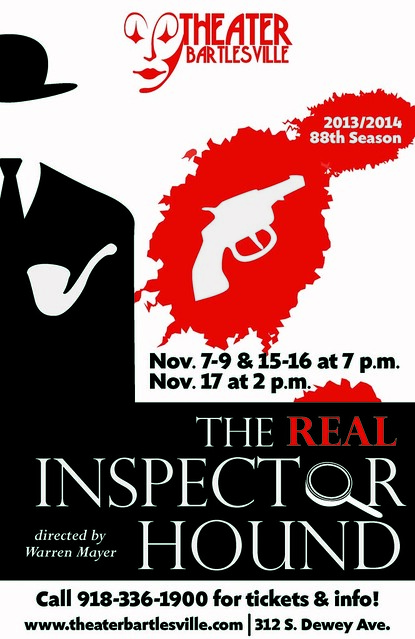
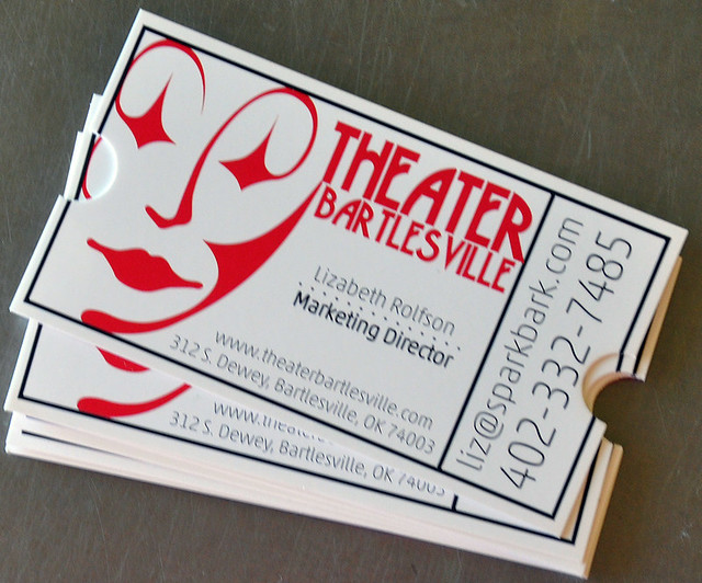
In other news, I’ve been elected Marketing Director for the local community theater: Theater Bartlesville. It’s going to be a fun way for me to make more local connections in the printing and publishing industry, as well as the arts. It’s a great board this year so I’ve already met some fantastic, intelligent, kind people. This won’t kill me for a year term, right?!

What I Designed Today: Climbing Logo

compiled

Here’s what I did today:  which would you choose?

What I Designed Today: Custom Illustrator Brushes

So I just realized today there’s a relatively new feature in Illustrator where you can choose which portion of your custom brush to allow to stretch. Hence, these cute little heart balloons for Valentine’s Day and four-leaf clovers for St. Patrick’s Day. Adorable, no? I love learning new things that make life easier.

(Not So) Recent Design Work: Pisgah Centennial Celebration Poster

poster11x17b

In an effort to get some of my older work online, here’s a piece from a 2004 Centennial Celebration in the town of Pisgah, Iowa. Great little town! This particular poster won a Silver Award from the Printing Industry of the Midlands. The printer submitted it without my knowledge and it won! He said that he submitted it after he saw several employees at the printing house put it up in their cubicles just because they liked it. Those crazy midwesterners that I adore!

What I Designed Today: Kara’s Party Ideas

indian-9c-682x1024

girl-indian-invite-half-horizontal

IMG_0960

IMG_0959

IMG_0961

I’ve been keeping this part under wraps for a bit but I think it’s safe to show you some of the work I’ve been coordinating and creating for Kara’s Party Ideas. Party goods are so. much. fun. to create compared to my more business-oriented clients like dermatology and politics! Check her site out: she is so the next Martha Stewart except she’s much more beautiful (inside and out)! Kara just launched sales of party goods on her site and I know she’s adding more so be sure and stop by Kara’s Party Ideas and you just might see something I helped design. The Superhero set is being printed in fabric and will be for sale soon! Adorable, no? Be sure to check out the Native American themed party – so cute!

What I Designed Today: the Basics of Designing Effective, Simple Black & White Ads

Nebraska Music Dealers & Exhibitors Association – NMDEA Ads

In 2006, a good friend asked me to redo the NMDEA black and white ad that had been running at their annual convention. It was a quick job so I agreed. I have now been doing their annual ad since 2006 and through two long distance moves! She approached me again this Spring for the 2012 ad and I thought it would be a good time to compile and compare past versions before I make something new. Sometimes I find an effective black and white or grayscale ad is much, much more difficult than a full color one. You have to really try to stand out from the crowd! My favorite was 2011, with the Nebraska outline used in the center. It’s funny how I can see a definite progression over the years to a better design – something I hadn’t noticed until they were side-by-side. Thanks to my friend, Marilyn, for the annual one-color challenge.

NMDEA-2011

NMDEA-2009

NMDEA-2007

NMDEA-2006

What I Designed Today: a Book Cover for Wake Up the Youth

611

Here is a book cover I did a few years ago (and finally read when I got asked to teach Old Testament to the high school sophomores this year). I highly recommend the book for anyone who teaches youth and especially love the bright green cover.

What I Designed Today: Logo Designs for Push-It Pallet

I was asked to create a logo for a company that uses padded pallets as jewelry display cases. The requirements were: blue and green colors and an arrow or “hook”. I chose to include a box to indicate more of what the company was about! I like the chosen logo because of its retro look. Here is the page of logos initially sent for review:

Here is the finished selection:

What I Designed Today: Logo Designs for Tech Learnology

Here are some quick logo samples I designed for a client in Houston. Which one is your favorite? Mine is the third from the top.