What I Designed Today: Farmers Market Business Cards

I have always been somewhat proud — that’s not quite the right word — of the fact that over 25 years of designing marketing materials for clients, I have NEVER advertised. I think it’s less pride than it is reassurance that my skills and talents are valued and worthwhile and not having to advertise is just a key performance indicator (KPI in the business world).

Front of the business card for Palisades Farmers Market in Washington D.C.
Back of the business card for Palisades Farmers Market in Washington D.C.

During my 6 years of consulting and humanitarian work, I didn’t design much of anything (although those skills did come in handy many times – particularly using MailChimp to send a regional newsletter but I digress…). Occasionally random strangers would still approach me via email or my website about design work. Most of the time, I’ve had to ignore those requests but I had some free time yesterday when an easy request arrived in my in-box and I learned a few things about myself:

  • I was giddily happy to be doing any kind of design work again. I just love to CREATE whether it’s a small business card or an entire marketing plan or confidence in a colleague or friend…creation is my “thing.”
  • Software is the same, but with wonderful upgrades — and believe it or not I kept up my Adobe subscription for 6 years while barely using it (now that’s a commitment to software you love).
  • I’ll never get used to switching from Mac to PC back to Mac again — muscle memory from years of shortcuts and keyboard strokes do NOT translate to the right buttons! I’ll get there…still loving my new MacBook…but probably just in time to get back to Windows 10 and a PC (which I despised at first but quickly came to love). I joke that we’re a non-denominational platform family — we like to use ALLLLLLL the devices available to improve our lives.

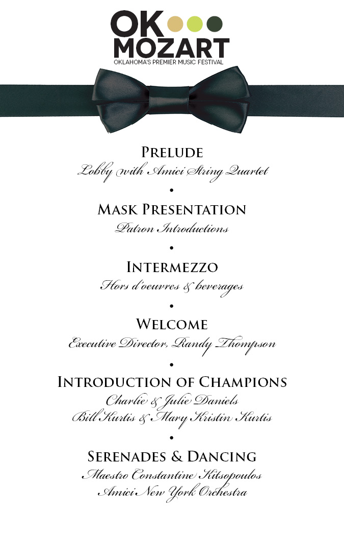
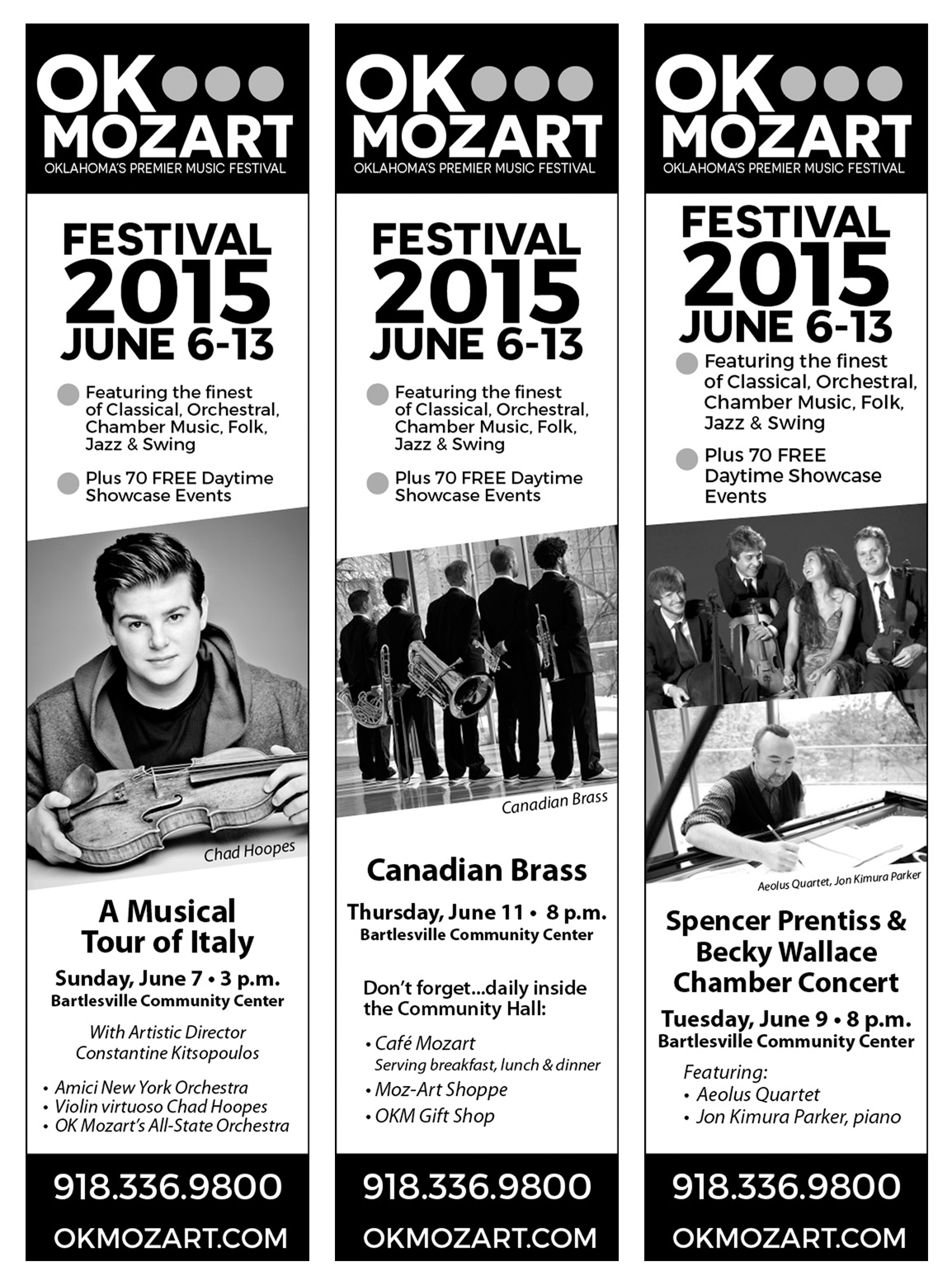
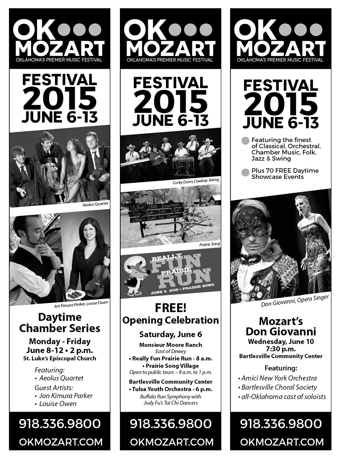
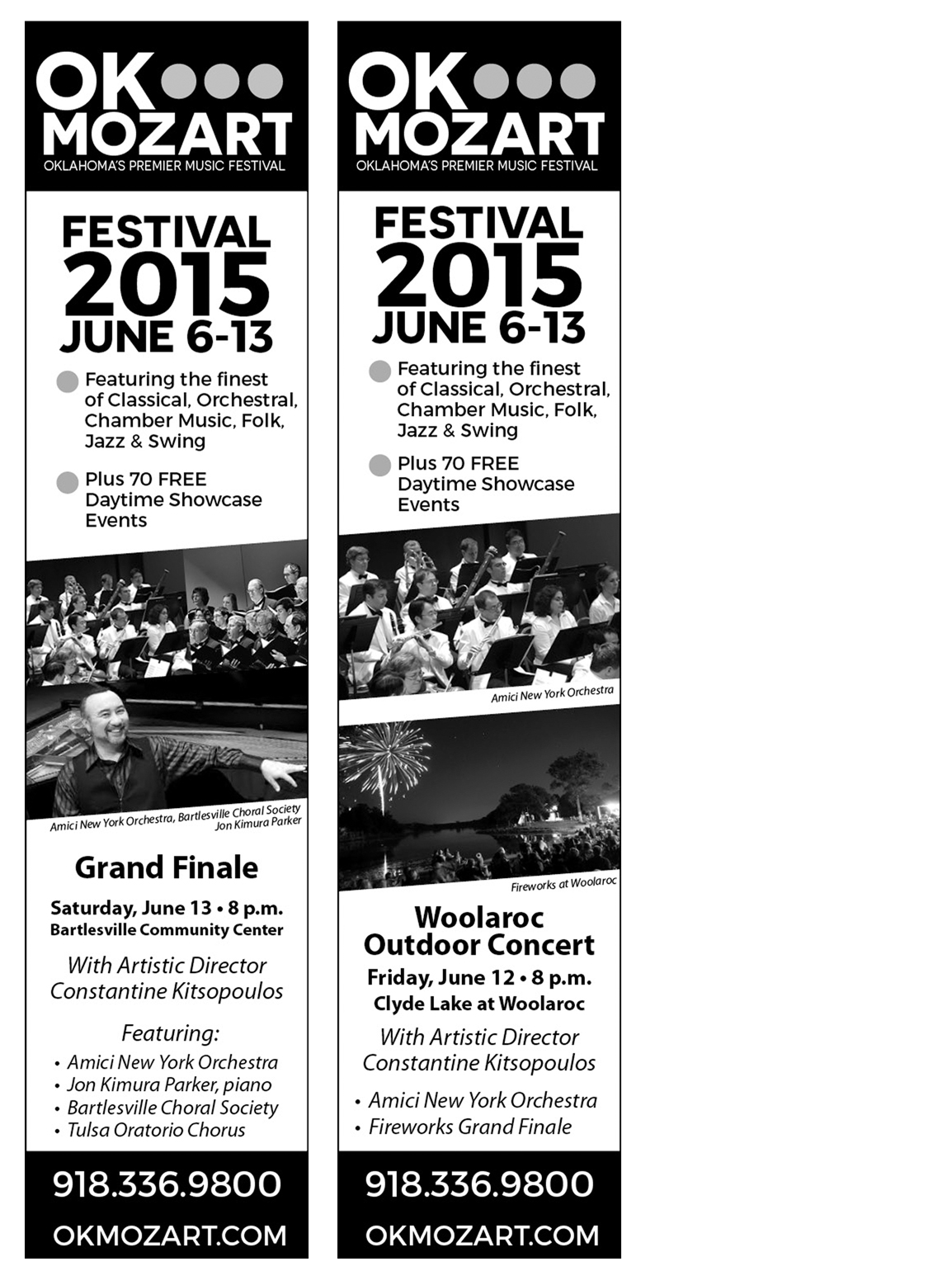
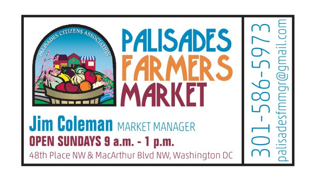
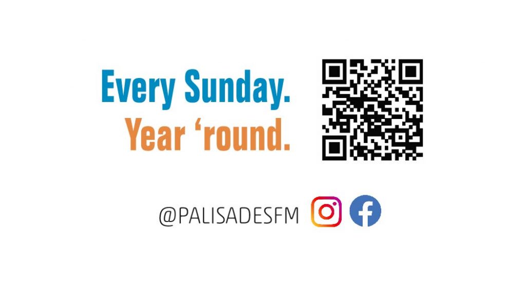
This new client found me via a simple Google search for “ticket business card” and came across this old post from 2013. Wow! That’s reassuring because even though I thought my skills were a bit rusty — and I’m sure they are — good design is timeless. I may not have the drawing skills I’d like but I can set up a typographical hierarchy like nobody’s business…and it was good to know I’ve still got it, it just takes a little longer than six years ago!

What I Designed Today: Billboards for Adam & Kizzie at OK Mozart’s Ambler Hall

Adam & Kizzie are coming to Bartlesville and it’s going to be a fantastic night of music at OK Mozart’s Ambler Hall.  This is a new direction for OK Mozart’s music selection and this duo with their gospel, blues, rock-n-roll and jazz sound are sure to please.  I can’t wait to hear how they sound in Ambler Hall.  If you’re local, info & tix are at okmozart.com.

Technically I designed these billboards a little over two weeks ago.  The traditional billboard goes up tomorrow and I hope to add a shot of that from the street as well.

Traditional billboard

adamandkizziekeleherfinal

Digital billboard

adamandkizziedigital1

Digital billboard from the street

digitalbillboard

What I Designed Today: Logo Guide for Bartlesville’s Ambler Hall

It’s not a full-on style guide but it’s a step in the right direction with a usage guide for the most common scenarios for a logo.  I’m so excited about some of the concerts coming up at Ambler Hall!  Check out Adam & Kizzie — they’re coming in November.  For more details, visit OK Mozart on the web.

logoguide1logoguide2

What I Designed Today: 2015 Bartlesville Oklahoma Stake Women’s Conference Invitations

These invitations use some lovely artwork of a young woman in armor originally created by Judy Cooley.  She graciously gave us permission to use them for our stake events (auxiliary conference and women’s conference) this year.  I love the ENLISTED adaptation of her work.  You can find more of her work if you search for Judy Cooley Deseret Book and Altus Fine Art.

2015rsposter

I’m excited that the service project this year is collecting or creating slippers for women at the Claremore Safenet Shelter (for women who suffer from domestic abuse or sexual assault).  2015stakersconfinvite1back

What I Designed Today, err…weeks ago: Father’s Day Poster & Coupons for La Fiesta

There’s a Mexican restaurant in Bartlesville, La Fiesta, that I’ve never been to — not because it’s not popular but because when we stayed in the hotel that shares it’s parking lot (while our home was under construction), we witnessed the chef puking out back then go back in.  The next night we witnessed an ambulance take away a customer.  We kind of figured that was an omen and wrote the restaurant off without ever actually trying it.  I found it interesting, then, that I was tempted to go when I was requested to design these coupons for Father’s Day.  I was relieved it was on Sunday because that eliminated my temptation altogether since we try our best to not eat out on the Sabbath Day.  I just may have to try it another time, though!

Here’s the original link to pieces of stock art by CharlieZ.  I like my adaptation and his stock art did make it very easy.

lafiestaposter1web

Quotes about the Holy Ghost

I had used these quotes a few years ago for a youth conference talk and I resurrected them (Ha!  See what I did there?!) for a Relief Society lesson this past Sunday.  Just thought I’d share them online, mostly so I don’t have to hunt them down on my hard drive if I ever want to use them again.

commune continuousrevelation hghealssoul indebtedforscriptures invite mirror spiritualgps witnessofchrist

What I Designed Today: Recreated a Farrier Logo

All design work isn’t fun or glamorous.  Scratch that.  MOST design work isn’t fun or glamorous at all because it’s the actual do-this-to-get-paid variety of work (even if it’s ugly).  Take this project:  I was asked to recreate a farrier’s logo for a 73″ wide banner.  It wasn’t difficult to do but it took time to redraw in Illustrator and get it right.  There was no using any sort of conceptual design skills — just rote recreation of a graphical element.  The project used my expertise of Illustrator but I had no creative liberty whatsoever, which is fine.  It pays the bills.  Just like any other occupation, graphic design is work — and work I’m grateful and blessed to have!  After all, there are worse ways to make a living…

PARSONSFARRIER1outlines-2web

What I Designed Today: Social Media Contest for Tate Boys Tire

One of Bartlesville’s finest local establishments, Tate Boys Tire, is running a social media contest and I was asked to design their promotional signs for print and online/web.  If you want to enter the contest, go to the Tate Boys Facebook Page and just like and share the image!

tateboysticket2redcroppedweb

What I Designed Today: L’Amore D’Italia Program for OK Mozart

The program for OK Mozart’s L’Amore d’Italia Ball is a smaller, 4-page, 1-fold piece.  I love the interior and it printed nicely on a heavy linen stock thanks to Bartlesville’s best print shop.  It turned out just lovely!  Osage Casinos sponsored the event and the mask picure on the cover was taken by local artist Gary Gibson.

amoreprogram1WEB amoreprogram1WEB2 amoreprogram1WEB3 amoreprogram1WEB4

What I Designed Today: Print Shop Docs with Horrible Fonts

I’m loving the interesting flow of work coming from Bartlesville’s local print shop.  There is, however, the problem of recreating things to print EXACTLY as a client requests — but that is ugly as all get-out.  It nearly killed me the other day to save a print-ready file using the Hobo font.  The project here called for Rage Italic and a graphic with lines that I absolutely do not understand (It’s so abstract, it could mean anything!).  Kill me now.  But, such is the life of a print shop — the client’s requests always come first!  And if you are the client and you happen to read this:  take it from an experienced designer — it’s time for an update on your logo and materials. You don’t even have to hire me.  Just, for the love of all that’s holy, refresh your brand.

Exhibit A:  Rage Italic in all its horrific 1980s glory — letterhead and envelopes.  Because a small town rec center is nothing if not thorough.
LETTERHEADCOFFEYVILLEREC1outlinesweb

coffeyvillerecenvelope1outlinesweb

What I Designed Today: Bartlesville’s 2 Plus 1 Show Concert Poster

lawsonposter2There’s a great little print shop here in Bartlesville, aptly named Bartlesville Print Shop.  The owner is a smart man.  He hired a talented young girl who is his right-hand-woman most days.  The girl is on a sabbatical for school or something (I forget; let’s face it, I can barely keep track of my own life) and even though I swore off taking additional work for the summer, I decided I could spare a month or so and help out the print shop on an as-needed, contract basis.  It’s kind of fun having a print shop as a client — which is actually a first for me.  It’s a never-ending stream of varied work!  It definitely keeps me on my toes.  This poster was designed a few days ago and by the next time I stopped into the shop, he had them printed and ready to go — such a great printer.  Seriously, if you don’t have a favorite local printer like ours in Bartlesville, go find one!  A good printer makes ALL the difference…

What I Designed Today: Interchangeable B&W Newspaper Ads

So, these are quite simple but since they’re only 2″ wide and they pack a lot of info, it is important to make them readable but still stand out on the entire huge newspaper print page full of black and white!  Enter the diagonally cropped picture.  It really works!  It adds just enough visual “movement” to help the ad stand out on the static page and draw the eye of the reader.  Take a look and see which is your favorite.  These 8 ads are being printed in a series in the Bartlesville Examiner-Enterprise newspaper, based on which performer is coming up next chronologically.

set1set2set3


What I Designed Today: OK Mozart Kids’ Events Poster & T-Shirt

These are similar to the Fun Run poster and t-shirt because it should have the same look but be independent. The Fun Run T-Shirt is going to be printed on sapphire blue so the t-shirt I’m suggesting here is to be printed on neon yellow. If it’s not in the budget this year, perhaps next. Bright colors are so much fun for t-shirts, especially for kids!

Poster design:

kidseventsposter

T-Shirt design:

kidsfestivalteeneon