These invitations use some lovely artwork of a young woman in armor originally created by Judy Cooley. She graciously gave us permission to use them for our stake events (auxiliary conference and women’s conference) this year. I love the ENLISTED adaptation of her work. You can find more of her work if you search for Judy Cooley Deseret Book and Altus Fine Art.

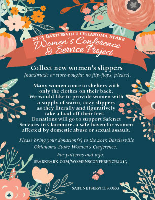
I’m excited that the service project this year is collecting or creating slippers for women at the Claremore Safenet Shelter (for women who suffer from domestic abuse or sexual assault).