What I Designed Today: Redesigned Newspaper Ads for OK Mozart

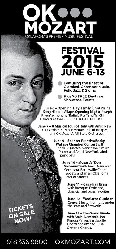
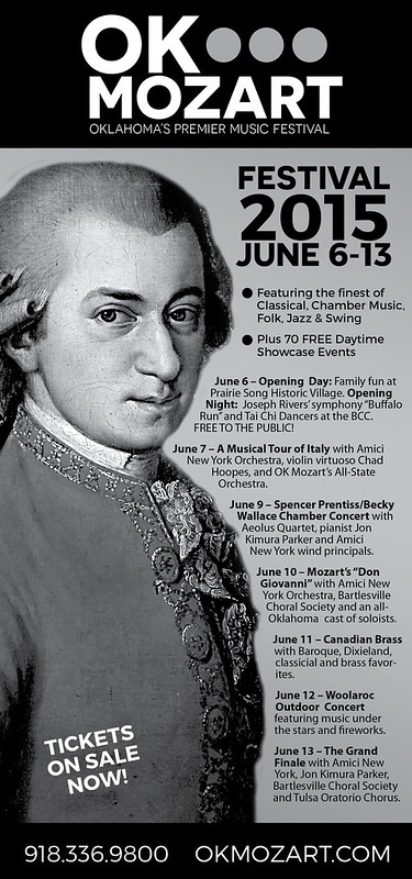
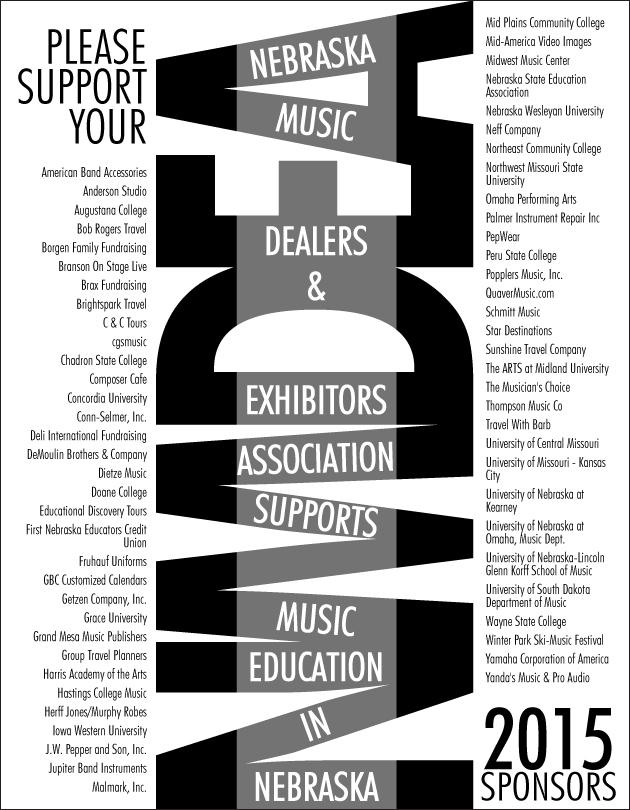
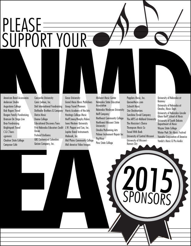
So our local newspaper is notorious for poorly printed ads. It seems OK Mozart gets the brunt of the poorly printed ads — even though they’ve checked and asked for proofs which always turn out fine! Black only can be so tricky. The grays look so washed out and since most of OK Mozart’s ads are black-intensive (using Rich Black in 4/c), I had to redesign some newspaper versions of their ads to hopefully boost contrast and not worry as much about printing striations. Frustrating! Anyway, here are some of the redesigns.

eeprogressnewFINAL2

eeprogressnew2

What I Designed Today: NMDEA Black & White Program Ads

I’ve been doing reincarnations of this black and white ad for years. This year, my client decided to bump up the size to a full page. The sponsors are probably so relieved to have their name in readable-sized print! Lovely client. I wish all of my clients were as prepared and easy to work with as this one. I’m not sure which one they’ll choose but I’m sure whichever it is, it’ll stand out in the program!

NMDEA20154

NMDEA20153

NMDEA20152

NMDEA20151