
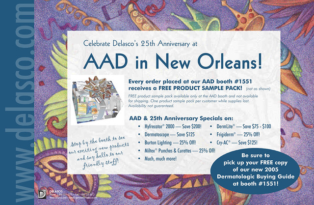
One of my freelance clients over the years has been Delasco — a fantastic company with fantastic employees. Did you know that they are the world’s largest dermatologic supplier? Not only have I done over a decade’s worth of their annual 250+ page, full-color catalog (from 1997 through 2010), I have helped them with many marketing and communications projects ranging from boxes and info sheets to forms, catalogs, ads and banners. They have been such a good client over the years that it would take hundreds – possibly thousands – of posts to show everything I’ve done for them. Some of the best moments, though, were found in developing life-long friendships with some amazing people (you know who you are!). Freelance work doesn’t have to be solitary — with clients like these, work can be uplifting and downright fun. The particular direct mailer above was used to announce their booth at an AAD meeting in New Orleans. It was a highly successful piece with a blue metallic PMS used for most of the background and the mailing side which I have yet to scan in and post.
