What I Designed Today: Ad Revisions for OK Mozart

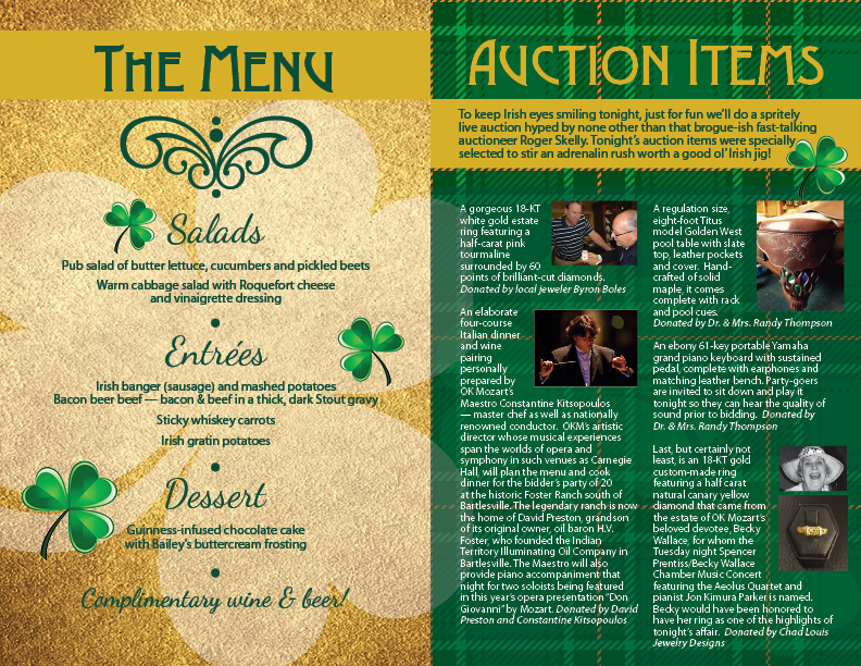
So one of my very favoritest sources of income is revising previously created ads in different sizes for different publications. It takes time, but you just have to adjust things without re-creating the wheel, so to speak. It probably takes more time than my client would think it does but it’s relatively painless and a good source of income — I want to say residual income but that’s not entirely correct because I’m still eating up the clock and sitting at the computer. They’re worth it even though I generally charge quite a bit less for them. These ads were for GTR Newspapers, an independent free papers association for Tulsa, Oklahoma Magazine, and Tulsa’s Currentland publication.

okmag1

currentlandmag1

GTRTulsa2

What I Designed Today: Custom Penzey’s Spice Jar Labels

My trip to Omaha over Spring Break was very fun — and very exhausting.  Now I’m back home in Bartlesville and there’s a zillion things I should be doing right now OTHER than making custom spice jar labels.  But I went to Penzey’s.  And I bought these cute jars with yummy spices (e.g., celery salt that actually smells like celery and salt).  It makes complete sense, right??  Right!  It just makes me feel better.  I’m attaching links to the file as a pdf and png, shown below, but if you’d like the original Illustrator CS5 file, just shoot me an email (the fonts used are Alex Brush and Zebrawood).  The PDF could also be edited in Adobe Acrobat. I hope it makes you “feel better” too.  Priorities, people.

PDF DOWNLOAD:  penzeysspicelabels

This pdf file is set up for HP Restickables (a sticker I highly recommend that is more like a post-it note that you can remove and reposition many times) – it’s from a really old stash and I don’t think anyone sells them anymore, but any basic sticker stock would do!  I manually cut out the labels.  Yes, I’m insane.  Who has time to do such a thing?  Certainly not me.  But I did cut them out, one by one, and it totally relaxed me.  The outline isn’t perfect but I’m seriously happy with them anyway.

spicejarfreetemplateDSC_0351penzeysspicelabels

What I Designed Today: Table Card for Bartlesville’s OK Mozart

This table card is part of the March Madness set for OK Mozart’s upcoming event in Bartlesville.  If you’re in the area, take a look at the lovely food and auction items — it will be a wonderful event!

tablecard5withbleed2

smtablecard6withbleed

What I Designed Today: OK Mozart Ads

One is a grayscale ad for newsprint and the second is a recreation of their ad in Conde Nast, originally done by PDG Creative, with the proper fonts of this year’s campaign and a little bit of a changeup in placement if items and photos (at OK Mozart’s request). It was a good work day, busy but not TOO stressful!

conderecreated1

eebwprogress2

What I Designed Today: March Madness Poster, Invitation & RSVP Card for OK Mozart

It’s 5:25 a.m. I’ve been up since 4 a.m. exporting files I finished yesterday, noting to myself in astonishment that in my 20s, I would stay up until 3 or 4 a.m. working on projects and now that I’ve reached my 40s, I GET UP at 4 a.m. to finish projects. There is something wrong with that!

Anyway, this includes the final touches of the poster written about earlier, including one pricing change. The entire set of marketing collateral for this event for OK Mozart includes a poster, a two-sided invitation, and an RSVP card. It’s a great set! I’m not a HUGE fan of the basketball with leprechaun hat but he’s kinda cute and growing on me. I customized him out of other stock pieces and parts. One would think there would be more basketball leprechauns given March Madness’ basketball theme, no? Well, one would be wrong {insert heavy pompous sarcasm here}.

posterweb

rsvp1web

invitefrontweb

invitebackweb

What I Designed Today: Kid’s Wolfie Mozart Design

What I designed today is still in the works but here’s the first draft. I had a client make an unusual request: they wanted a mascot of sorts for their children’s publications. It’s not their logo, but it’s a friendly “wolfie” which was, apparently, Mozart’s nickname as a youth. He’s to be splashed all over their publications involving youth during the coming year. I’ve created two wolfies (each with slight variations): one for a younger audience, heavily based off this royalty-free art from comodo777 at BigStock and a second one entirely created by me for a slightly older audience. Which would you choose?  Let me just say, drawing that wig was so satisfying!  And, also, there is zero vector artwork readily available for Mozart wigs.  Just sayin’.  Well, now there’s one…

mozartwolfie1

What I Designed Today: Christmas Cards for OK Mozart

I loved doing this last year (see below for last year’s version).  This year, another local design company has generously volunteered their time (okay, their interns’ time) to redesign the logo for next year so I changed the Christmas card design to match the lovely greens and sent them two options below.  I would have wrapped their logo on the ornament but these were initial proofs and they chose the dark green so I didn’t bother.  Which do you prefer?

OK Mozart Christmas Card 2013

christmascard120913bWEB


OK Mozart Christmas Card – two options for 2014

christmascard120814final3

christmascard120814b

What I Designed Today: Writing & designing for RunHaven

So excited to announce a new venture with RunHaven as a writer AND designer for their site.  Here’s my first graphic that I did for them.  I’m only showing 2 of 4 formats here but you get the idea (one for each specific social media size).  Be sure to pop over to their site and check it out!!!  Background image: halfpoint/Bigstock.

RUNAWAY-bigstock-halfpoint-52515076-Web345x150

RUNAWAY-bigstock-halfpoint-52515076-WP650x340

What I Designed Today: A poster for Lemon Tart by Josi Kilpack

lemonposter5sm

It’s been a long time since I blogged.  Almost a year, in fact.  I’ve missed it!  In my time away, I’ve done many things and learned quite a bit.  Let’s see how much of that I can get documented down the road but, for now, here’s some recent work I completed for Theater Bartlesville — even though I’m no longer serving on their board this year.  Last year was so much fun, not to mention meeting some pretty amazing people, but I simply don’t have time to do it again.  I won’t be doing most of their items but as a huge Josi Kilpack fan, this poster design I just couldn’t resist.  Can’t wait to meet her at the fundraiser. And, for all you font nerds out there like me, the font is My Aunt Celia and you can buy it at MyFonts.

What I Designed Today: Banner Ads for The Artful Ewe

theartfulewe2

theartfulewe

I love knitting. I love banner ads – so small and easy, right? Well, sometimes the small size can be really constraining. I left the ribbon-like banner at the top of one of the ads so perhaps the white space above would set it apart from other banner ads. Anyway – it’s yarn! What’s not to love?

What I Designed Today: Billboard Artwork for “The Real Inspector Hound” for Theater Bartlesville

TRIHbillboardwithhalfinchbleed2

Final billboard.

12x18poster2cropped

Final poster.

I ran a test vote on Facebook with my 777 friends and the red poster won out over the sideways-text white one by a thin margin. We’re using the red poster with the spyglass from one of the others. Good combo. This made the billboard much easier to do!

What I Designed Today: Steam Train Tickets

Print

Print

A steam train engineer requested tickets for an upcoming birthday party for a local Steam Train No. 940. He wanted a punch card for the kids to use for the party. I love trains!

What I Designed Today: Climbing Logo

compiled

Here’s what I did today:  which would you choose?

What I Designed Today: Kara’s Party Ideas

indian-9c-682x1024

girl-indian-invite-half-horizontal

IMG_0960

IMG_0959

IMG_0961

I’ve been keeping this part under wraps for a bit but I think it’s safe to show you some of the work I’ve been coordinating and creating for Kara’s Party Ideas. Party goods are so. much. fun. to create compared to my more business-oriented clients like dermatology and politics! Check her site out: she is so the next Martha Stewart except she’s much more beautiful (inside and out)! Kara just launched sales of party goods on her site and I know she’s adding more so be sure and stop by Kara’s Party Ideas and you just might see something I helped design. The Superhero set is being printed in fabric and will be for sale soon! Adorable, no? Be sure to check out the Native American themed party – so cute!

What I Designed Today: the Basics of Designing Effective, Simple Black & White Ads

Nebraska Music Dealers & Exhibitors Association – NMDEA Ads

In 2006, a good friend asked me to redo the NMDEA black and white ad that had been running at their annual convention. It was a quick job so I agreed. I have now been doing their annual ad since 2006 and through two long distance moves! She approached me again this Spring for the 2012 ad and I thought it would be a good time to compile and compare past versions before I make something new. Sometimes I find an effective black and white or grayscale ad is much, much more difficult than a full color one. You have to really try to stand out from the crowd! My favorite was 2011, with the Nebraska outline used in the center. It’s funny how I can see a definite progression over the years to a better design – something I hadn’t noticed until they were side-by-side. Thanks to my friend, Marilyn, for the annual one-color challenge.

NMDEA-2011

NMDEA-2009

NMDEA-2007

NMDEA-2006