What I Designed Today, err…weeks ago: Father’s Day Poster & Coupons for La Fiesta

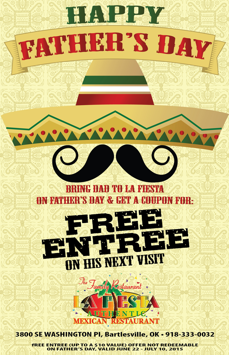
There’s a Mexican restaurant in Bartlesville, La Fiesta, that I’ve never been to — not because it’s not popular but because when we stayed in the hotel that shares it’s parking lot (while our home was under construction), we witnessed the chef puking out back then go back in.  The next night we witnessed an ambulance take away a customer.  We kind of figured that was an omen and wrote the restaurant off without ever actually trying it.  I found it interesting, then, that I was tempted to go when I was requested to design these coupons for Father’s Day.  I was relieved it was on Sunday because that eliminated my temptation altogether since we try our best to not eat out on the Sabbath Day.  I just may have to try it another time, though!

Here’s the original link to pieces of stock art by CharlieZ.  I like my adaptation and his stock art did make it very easy.

lafiestaposter1web

What I Designed Today: Recreated a Farrier Logo

All design work isn’t fun or glamorous.  Scratch that.  MOST design work isn’t fun or glamorous at all because it’s the actual do-this-to-get-paid variety of work (even if it’s ugly).  Take this project:  I was asked to recreate a farrier’s logo for a 73″ wide banner.  It wasn’t difficult to do but it took time to redraw in Illustrator and get it right.  There was no using any sort of conceptual design skills — just rote recreation of a graphical element.  The project used my expertise of Illustrator but I had no creative liberty whatsoever, which is fine.  It pays the bills.  Just like any other occupation, graphic design is work — and work I’m grateful and blessed to have!  After all, there are worse ways to make a living…

PARSONSFARRIER1outlines-2web

What I Designed Today: Social Media Contest for Tate Boys Tire

One of Bartlesville’s finest local establishments, Tate Boys Tire, is running a social media contest and I was asked to design their promotional signs for print and online/web.  If you want to enter the contest, go to the Tate Boys Facebook Page and just like and share the image!

tateboysticket2redcroppedweb

What I Designed Today: L’Amore D’Italia Program for OK Mozart

The program for OK Mozart’s L’Amore d’Italia Ball is a smaller, 4-page, 1-fold piece.  I love the interior and it printed nicely on a heavy linen stock thanks to Bartlesville’s best print shop.  It turned out just lovely!  Osage Casinos sponsored the event and the mask picure on the cover was taken by local artist Gary Gibson.

amoreprogram1WEB amoreprogram1WEB2 amoreprogram1WEB3 amoreprogram1WEB4

What I Designed Today: Print Shop Docs with Horrible Fonts

I’m loving the interesting flow of work coming from Bartlesville’s local print shop.  There is, however, the problem of recreating things to print EXACTLY as a client requests — but that is ugly as all get-out.  It nearly killed me the other day to save a print-ready file using the Hobo font.  The project here called for Rage Italic and a graphic with lines that I absolutely do not understand (It’s so abstract, it could mean anything!).  Kill me now.  But, such is the life of a print shop — the client’s requests always come first!  And if you are the client and you happen to read this:  take it from an experienced designer — it’s time for an update on your logo and materials. You don’t even have to hire me.  Just, for the love of all that’s holy, refresh your brand.

Exhibit A:  Rage Italic in all its horrific 1980s glory — letterhead and envelopes.  Because a small town rec center is nothing if not thorough.
LETTERHEADCOFFEYVILLEREC1outlinesweb

coffeyvillerecenvelope1outlinesweb

What I Designed Today: Bartlesville’s 2 Plus 1 Show Concert Poster

lawsonposter2There’s a great little print shop here in Bartlesville, aptly named Bartlesville Print Shop.  The owner is a smart man.  He hired a talented young girl who is his right-hand-woman most days.  The girl is on a sabbatical for school or something (I forget; let’s face it, I can barely keep track of my own life) and even though I swore off taking additional work for the summer, I decided I could spare a month or so and help out the print shop on an as-needed, contract basis.  It’s kind of fun having a print shop as a client — which is actually a first for me.  It’s a never-ending stream of varied work!  It definitely keeps me on my toes.  This poster was designed a few days ago and by the next time I stopped into the shop, he had them printed and ready to go — such a great printer.  Seriously, if you don’t have a favorite local printer like ours in Bartlesville, go find one!  A good printer makes ALL the difference…

What I Designed Today: Interchangeable B&W Newspaper Ads

So, these are quite simple but since they’re only 2″ wide and they pack a lot of info, it is important to make them readable but still stand out on the entire huge newspaper print page full of black and white!  Enter the diagonally cropped picture.  It really works!  It adds just enough visual “movement” to help the ad stand out on the static page and draw the eye of the reader.  Take a look and see which is your favorite.  These 8 ads are being printed in a series in the Bartlesville Examiner-Enterprise newspaper, based on which performer is coming up next chronologically.

set1set2set3


What I Designed Today: OK Mozart Kids’ Events Poster & T-Shirt

These are similar to the Fun Run poster and t-shirt because it should have the same look but be independent. The Fun Run T-Shirt is going to be printed on sapphire blue so the t-shirt I’m suggesting here is to be printed on neon yellow. If it’s not in the budget this year, perhaps next. Bright colors are so much fun for t-shirts, especially for kids!

Poster design:

kidseventsposter

T-Shirt design:

kidsfestivalteeneon

What I Designed Today: OK Mozart International Music Festival T-Shirts

I submitted about 9 different designs and these are my favorite versions.  The local printer prefers one color, so I was challenged to do an eye catching design while only using one or two colors to keep costs low.  Mission accomplished!  Which design would you prefer?  Do you think Mozart actually said these quotes?  Logo front pocket, this design printed large on the back side of the t-shirt design.

festivaltee1

lovelovelovegenius

mozartmusicquote3

festivaltee2

In the end, in a somewhat heated debate, my client chose to print two different designs — each of which was liked by different personnel who adamantly did not like the other design!  Which makes me think of the phrase, “If everybody likes what you’re doing, you’re doing something wrong!” Not a bad motto to live by! I’m curious, though, which of the two below would you choose?

festivaltee1  

1red

What I Designed Today: Stake Conference Invitation

I designed this stake conference invitation for the first semiannual conference of the Bartlesville, Oklahoma Stake!  So nice of the stake presidency to put out an official invitation like this.  I hope it helps boost attendance and clarifies meeting times, attendance and info for all involved.  I tried to make it  match the ward mission plan and the stake mission plan that I had created earlier.  I’d better watch out or the stake will have inadvertently created its own press kit and style guide soon!  Kidding…

2015springstakeconwebf


What I Designed Today: 2015 OK Mozart Festival Poster

thumbnailgenfestivalposterfinalWEB

What I Designed Today (ahem, last week): OK Mozart A Really Fun Prairie Run Event Poster

I really need to do better at publishing daily so I don’t have to keep backtracking!  But I’ve been working way too much and there’s no way I can post it all.  That’s good, right?!

thumbnailfunrunfinal


What I Designed Today: 2015 OK Mozart L’Amore d’Italia Ball Invitation & RSVP Card

amoreinvitation1web amoreinvitation1web2 amorersvp1web

What I Designed Today (a few weeks ago): Put on The Armor of God for Stake Auxiliary Training

I used the floral artwork from lenlis at BigStock for the flowers and then added the “Put on the Armor of God” text and made a few changes to use for a themed presentation at auxiliary training. It was so cute, I left it up at home for a week after the event! I’m including pics of the wonderful cookies with labels and chocolate covered strawberries served. I don’t know if anybody else liked it but the strawberries alone were worth it for me!

IMG_0899

IMG_0902

IMG_0901

IMG_0900

What I Designed Today: Redesigned Newspaper Ads for OK Mozart

So our local newspaper is notorious for poorly printed ads. It seems OK Mozart gets the brunt of the poorly printed ads — even though they’ve checked and asked for proofs which always turn out fine! Black only can be so tricky. The grays look so washed out and since most of OK Mozart’s ads are black-intensive (using Rich Black in 4/c), I had to redesign some newspaper versions of their ads to hopefully boost contrast and not worry as much about printing striations. Frustrating! Anyway, here are some of the redesigns.

eeprogressnewFINAL2

eeprogressnew2