I really need to do better at publishing daily so I don’t have to keep backtracking! But I’ve been working way too much and there’s no way I can post it all. That’s good, right?!

I really need to do better at publishing daily so I don’t have to keep backtracking! But I’ve been working way too much and there’s no way I can post it all. That’s good, right?!
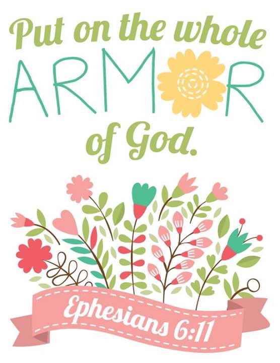
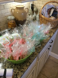
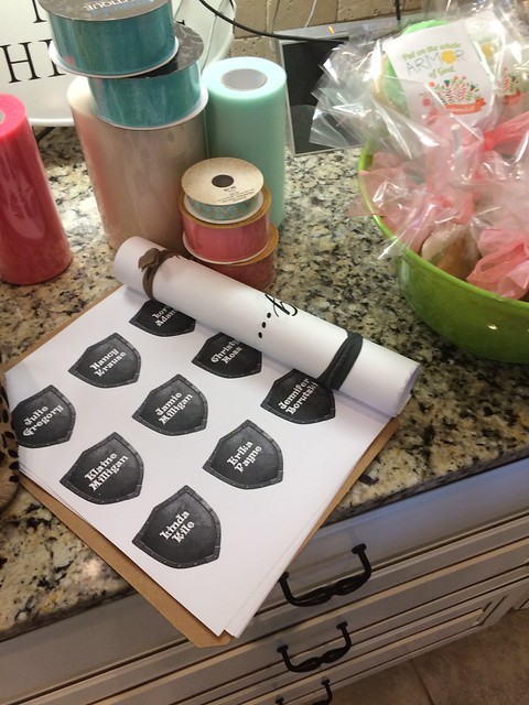
I used the floral artwork from lenlis at BigStock for the flowers and then added the “Put on the Armor of God” text and made a few changes to use for a themed presentation at auxiliary training. It was so cute, I left it up at home for a week after the event! I’m including pics of the wonderful cookies with labels and chocolate covered strawberries served. I don’t know if anybody else liked it but the strawberries alone were worth it for me!

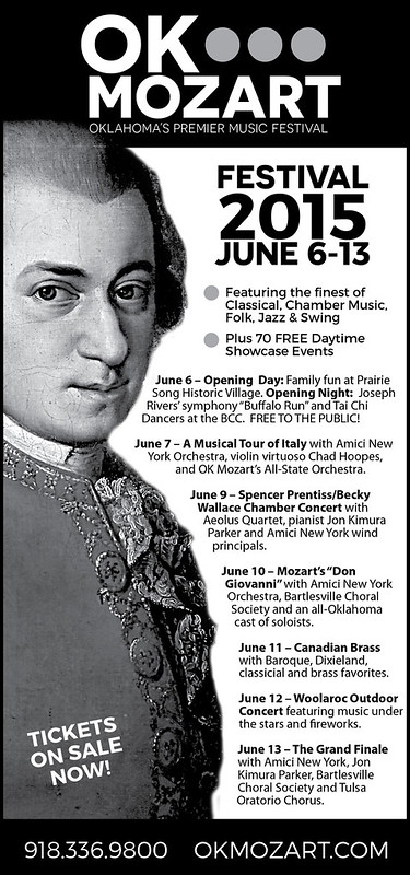
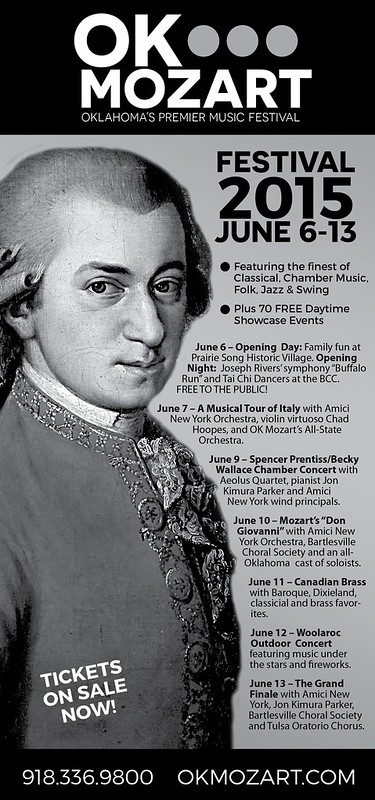
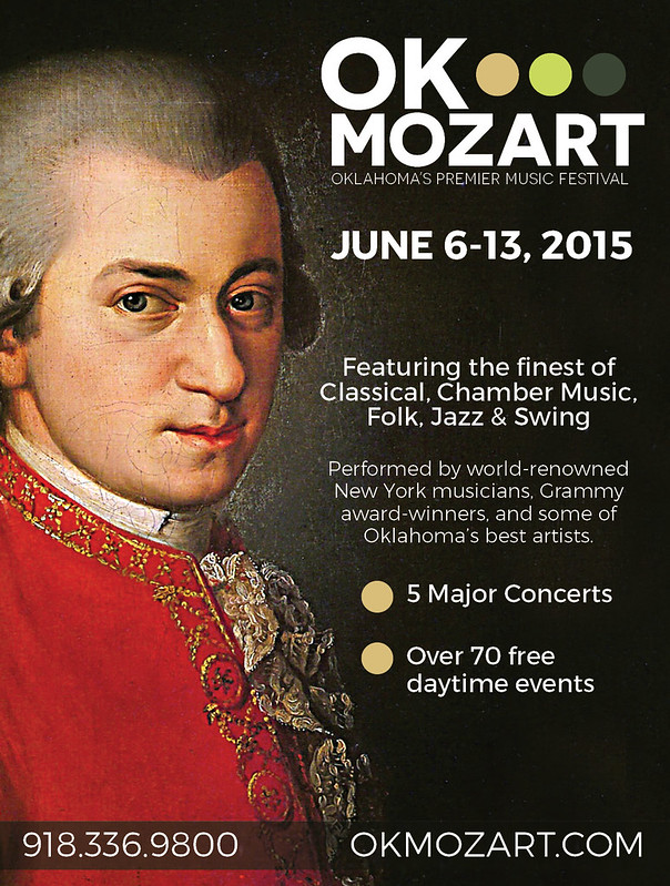
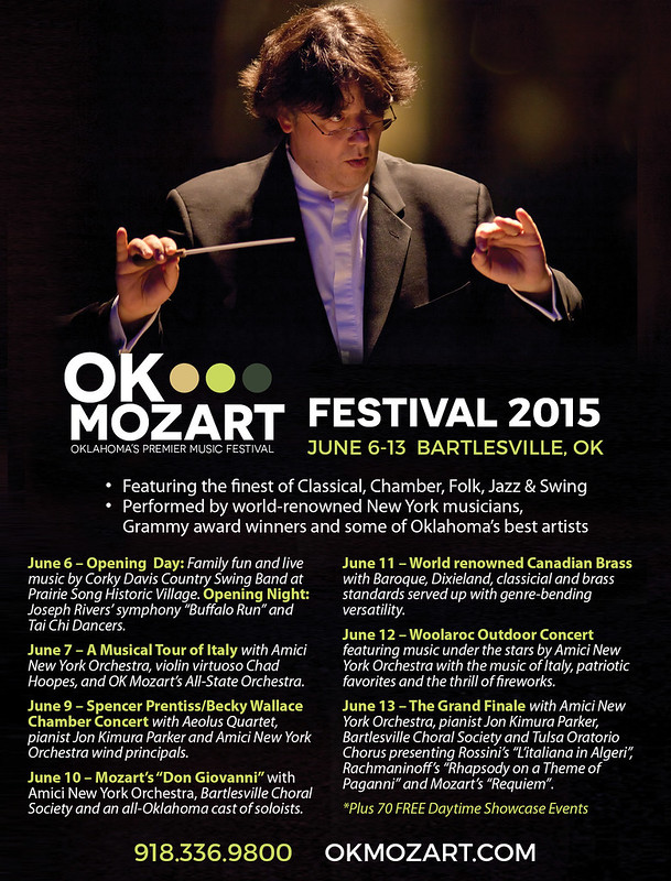
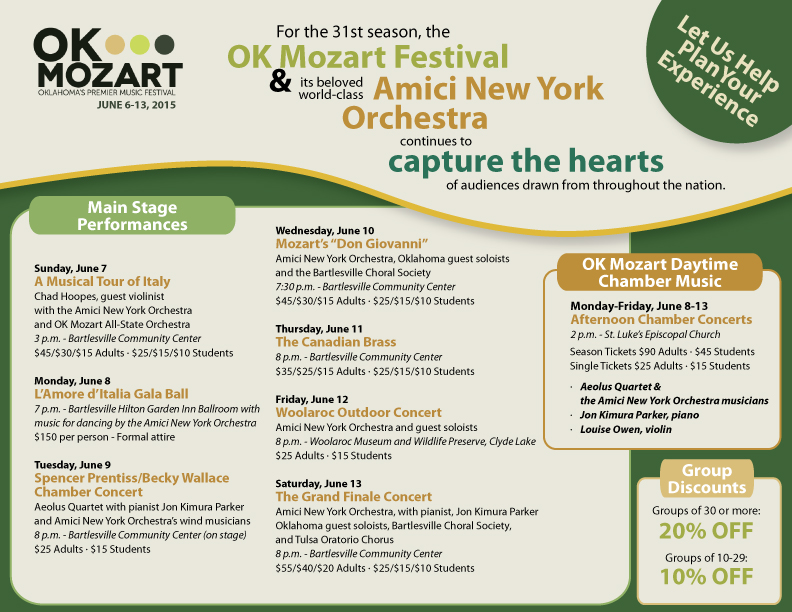
So our local newspaper is notorious for poorly printed ads. It seems OK Mozart gets the brunt of the poorly printed ads — even though they’ve checked and asked for proofs which always turn out fine! Black only can be so tricky. The grays look so washed out and since most of OK Mozart’s ads are black-intensive (using Rich Black in 4/c), I had to redesign some newspaper versions of their ads to hopefully boost contrast and not worry as much about printing striations. Frustrating! Anyway, here are some of the redesigns.
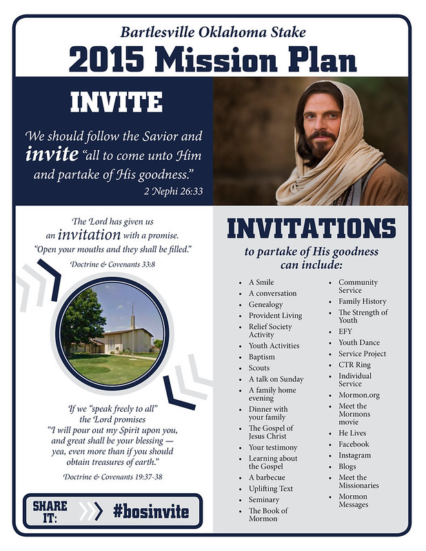
The 2015 Ward Mission Plan was such a success, I got roped into creating a Stake Mission Plan. The text wasn’t as conducive to a great layout but I think it’s nice enough, anyway.
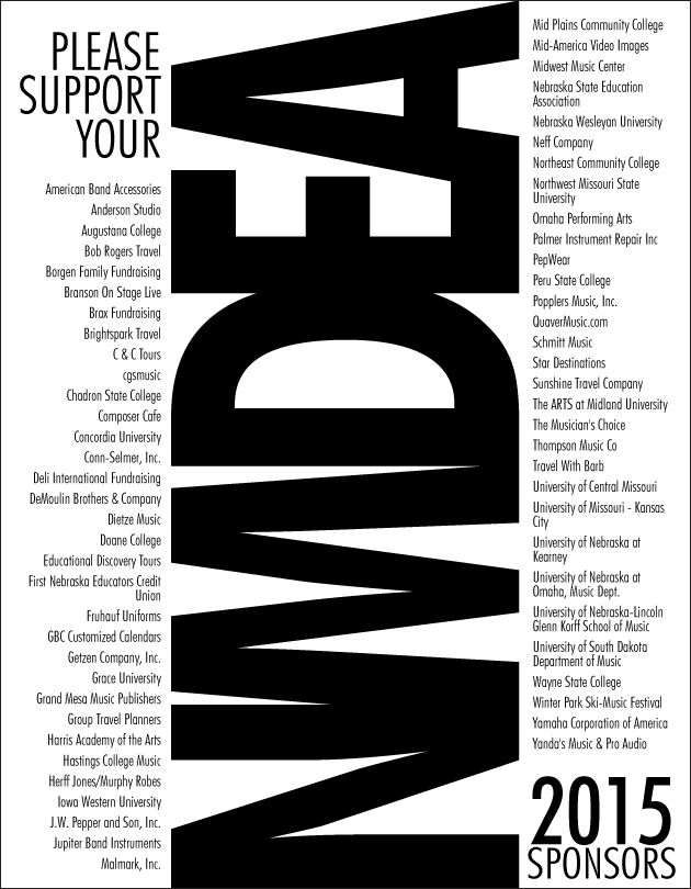
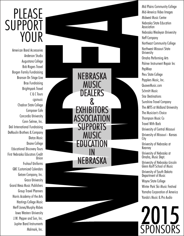
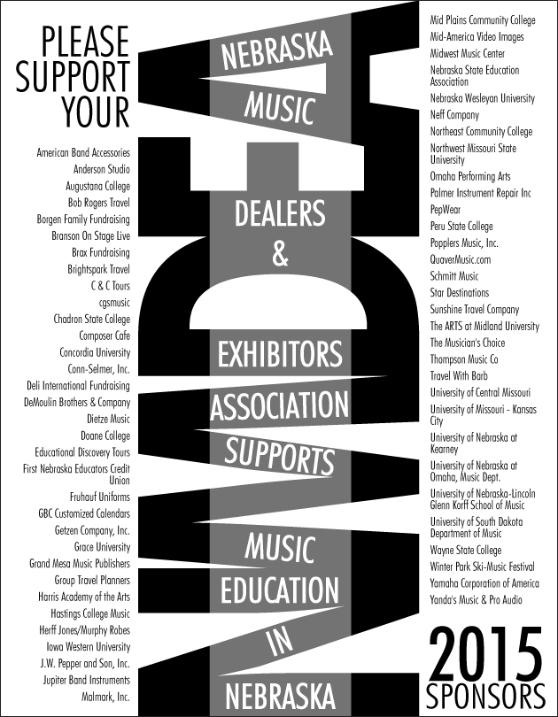
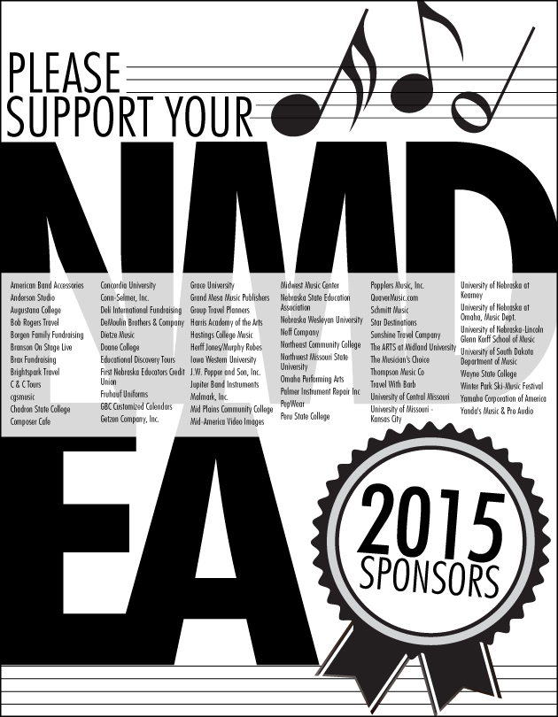
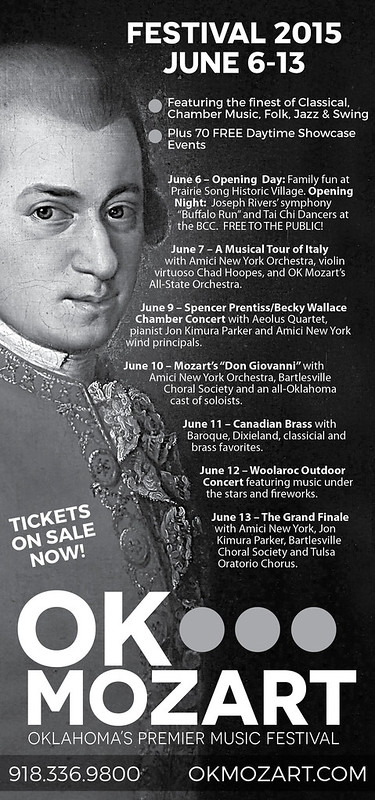
I’ve been doing reincarnations of this black and white ad for years. This year, my client decided to bump up the size to a full page. The sponsors are probably so relieved to have their name in readable-sized print! Lovely client. I wish all of my clients were as prepared and easy to work with as this one. I’m not sure which one they’ll choose but I’m sure whichever it is, it’ll stand out in the program!
So one of my very favoritest sources of income is revising previously created ads in different sizes for different publications. It takes time, but you just have to adjust things without re-creating the wheel, so to speak. It probably takes more time than my client would think it does but it’s relatively painless and a good source of income — I want to say residual income but that’s not entirely correct because I’m still eating up the clock and sitting at the computer. They’re worth it even though I generally charge quite a bit less for them. These ads were for GTR Newspapers, an independent free papers association for Tulsa, Oklahoma Magazine, and Tulsa’s Currentland publication.

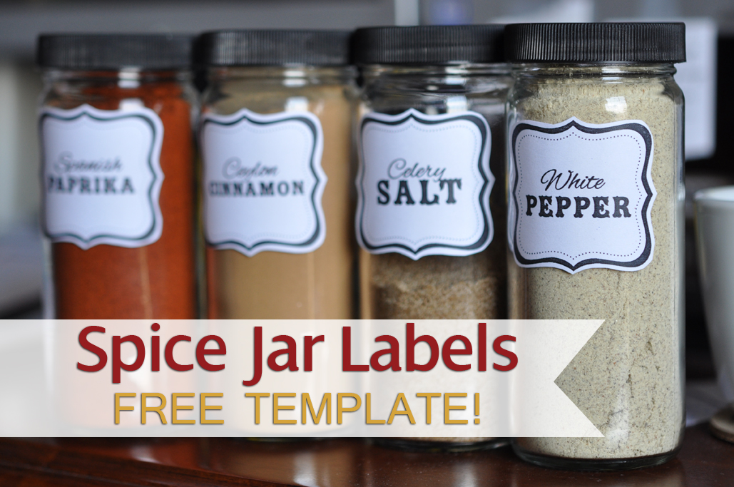
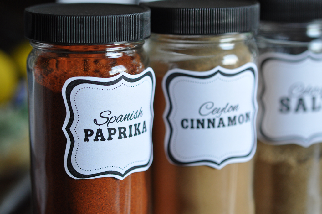
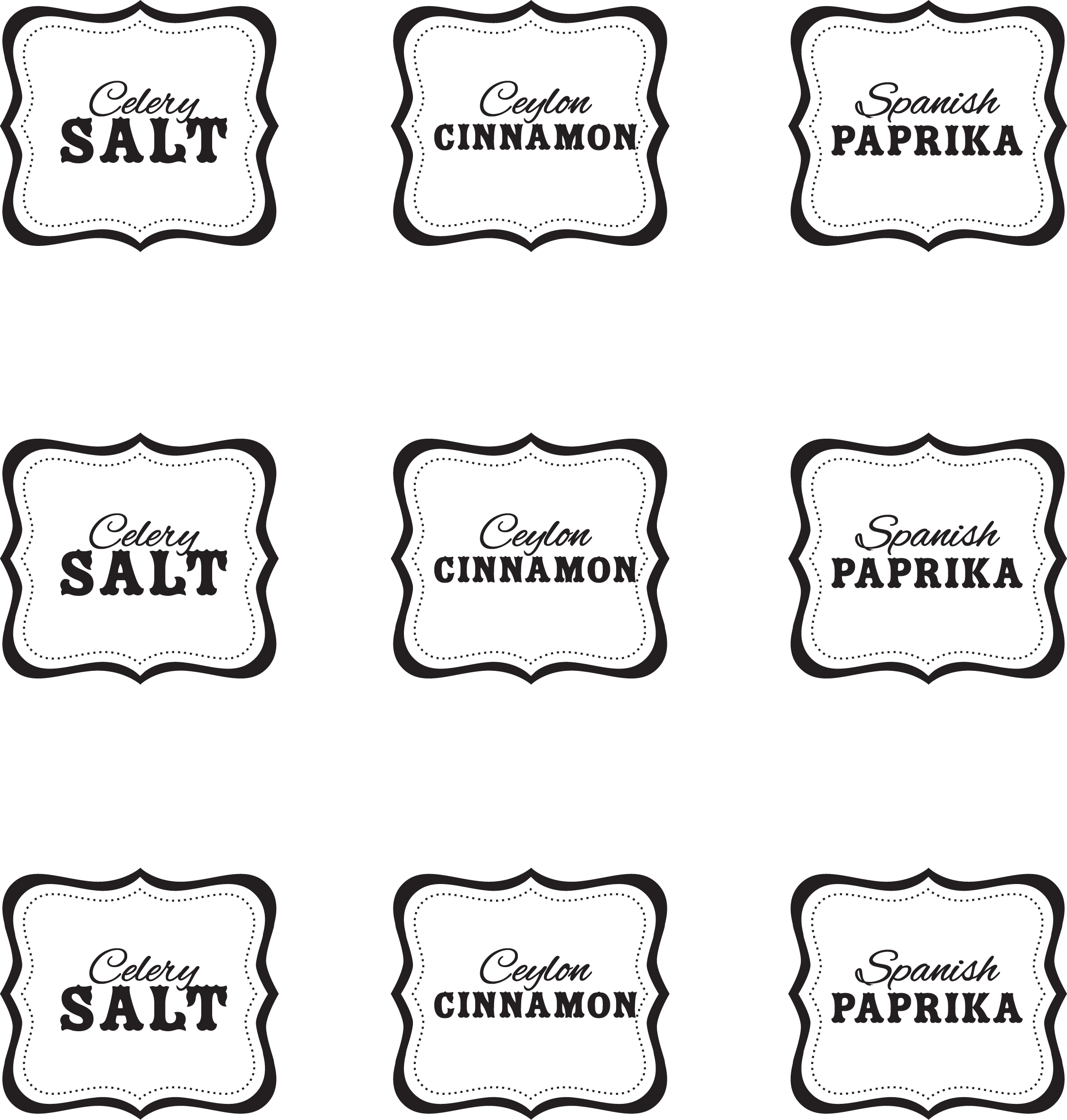
My trip to Omaha over Spring Break was very fun — and very exhausting. Now I’m back home in Bartlesville and there’s a zillion things I should be doing right now OTHER than making custom spice jar labels. But I went to Penzey’s. And I bought these cute jars with yummy spices (e.g., celery salt that actually smells like celery and salt). It makes complete sense, right?? Right! It just makes me feel better. I’m attaching links to the file as a pdf and png, shown below, but if you’d like the original Illustrator CS5 file, just shoot me an email (the fonts used are Alex Brush and Zebrawood). The PDF could also be edited in Adobe Acrobat. I hope it makes you “feel better” too. Priorities, people.
PDF DOWNLOAD: penzeysspicelabels
This pdf file is set up for HP Restickables (a sticker I highly recommend that is more like a post-it note that you can remove and reposition many times) – it’s from a really old stash and I don’t think anyone sells them anymore, but any basic sticker stock would do! I manually cut out the labels. Yes, I’m insane. Who has time to do such a thing? Certainly not me. But I did cut them out, one by one, and it totally relaxed me. The outline isn’t perfect but I’m seriously happy with them anyway.
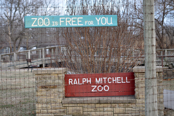
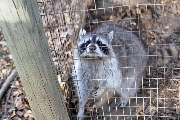
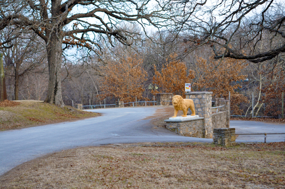
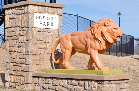
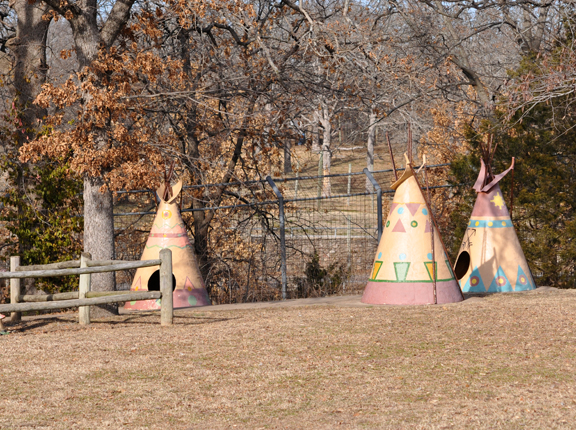
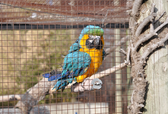
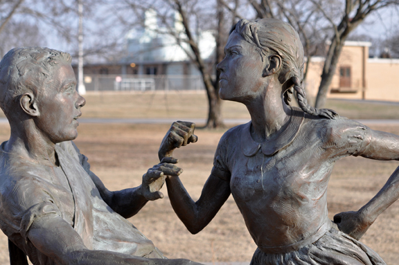
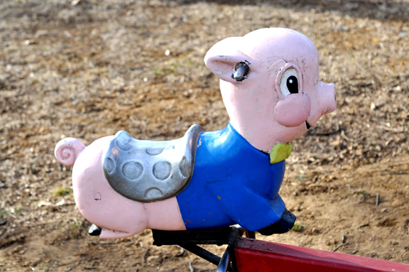
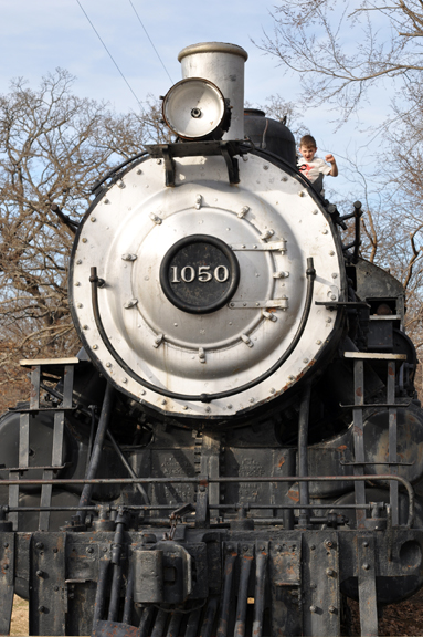
I’m writing an article about the Riverside Park, Ralph Mitchell Zoo & Riverside Aquatic Center for the upcoming Visitor’s Guide & Travel Edition of Bartlesville Magazine. It is one of our family’s favorite places, so we took a quick trip up on Saturday to get some great photographs and finish up the article. I’m including a few fave photos here, but the entire set can be viewed in our Zoo & Park Set on Flickr.


This guide was commissioned for a company that is still in the works. I’m not posting the whole thing here but just my favorite parts for those who might need some ideas in creating their own branding guidelines. There are some lovely guidelines out there but it does take some good google-sleuthing to find them!
![]()
![]()
![]()
![]()
![]()
![]()
![]()
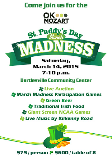
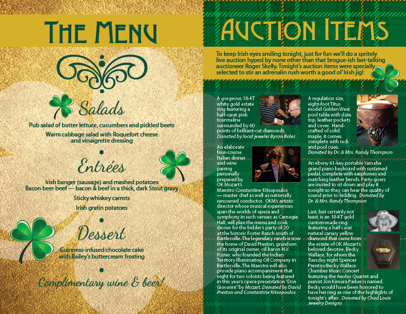
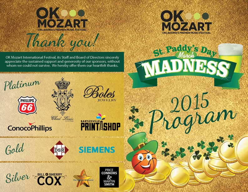
This table card is part of the March Madness set for OK Mozart’s upcoming event in Bartlesville. If you’re in the area, take a look at the lovely food and auction items — it will be a wonderful event!
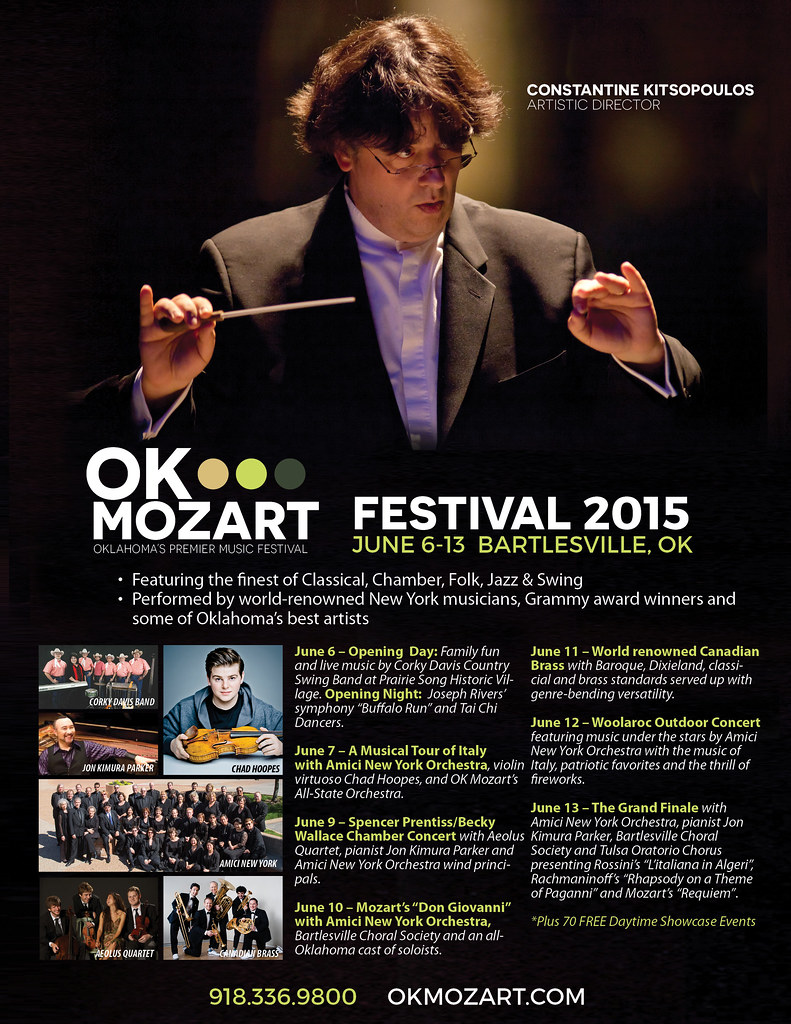
One is a grayscale ad for newsprint and the second is a recreation of their ad in Conde Nast, originally done by PDG Creative, with the proper fonts of this year’s campaign and a little bit of a changeup in placement if items and photos (at OK Mozart’s request). It was a good work day, busy but not TOO stressful!
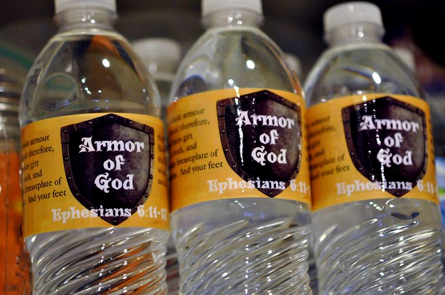
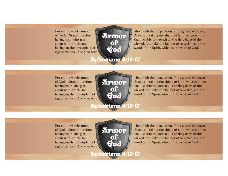
One of my most popular posts is a Jesus is the Living Water Bottle Labels here. I’m not sure I quite understand the craze of custom water bottle labels but they are kind of fun! Here’s an Armor of God water bottle label quoting parts of Ephesians 6:11-17. Just print, trim, wrap on the bottle and tape. Enjoy!
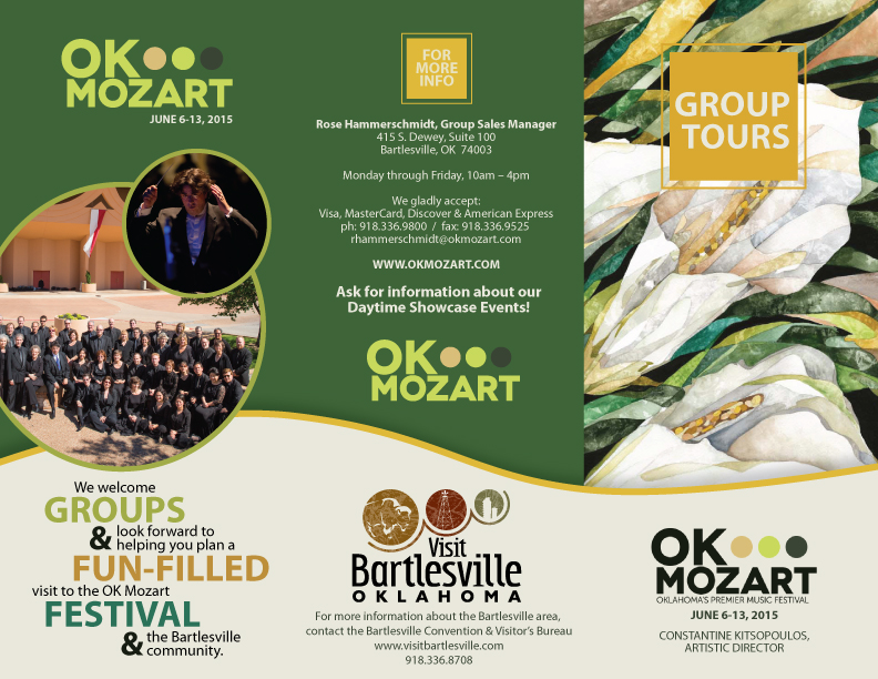
Tri-fold brochures are the bread and butter of marketing, aside from business cards. They give you a chance to show and tell what your business is about. Designs that flow well are few and far between but I like how this one turned out. The only thing I would add or change now are calla lily leaves following the curved divider or at the top right hand corner of the circles. Can’t wait to see this one in print!
It’s 5:25 a.m. I’ve been up since 4 a.m. exporting files I finished yesterday, noting to myself in astonishment that in my 20s, I would stay up until 3 or 4 a.m. working on projects and now that I’ve reached my 40s, I GET UP at 4 a.m. to finish projects. There is something wrong with that!
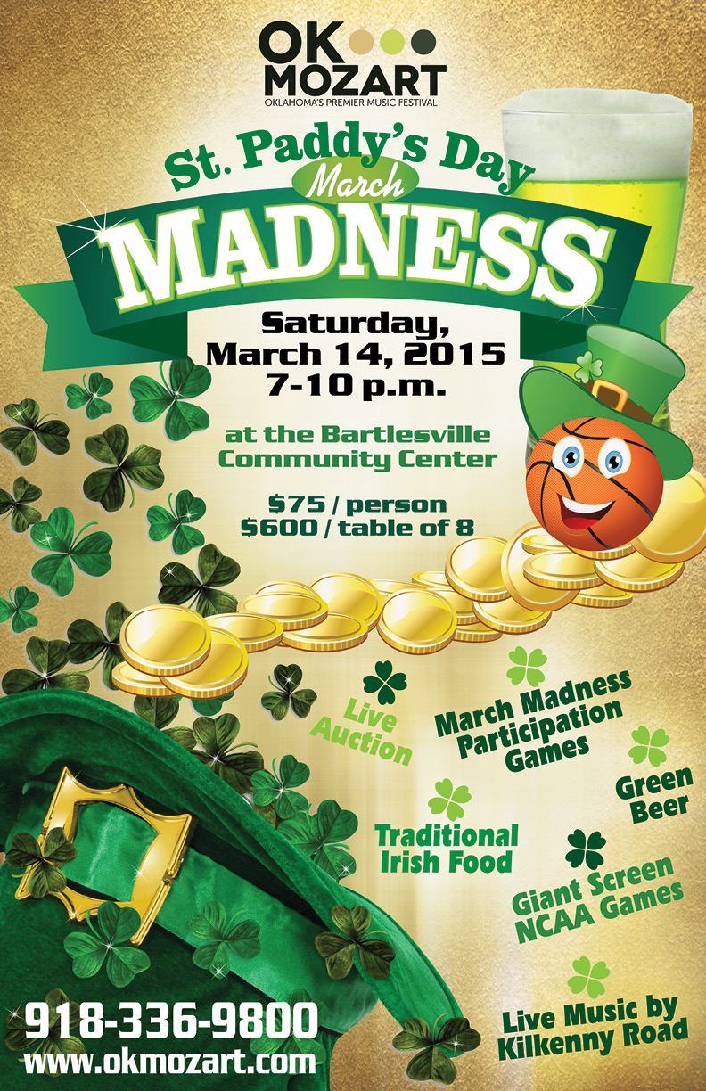
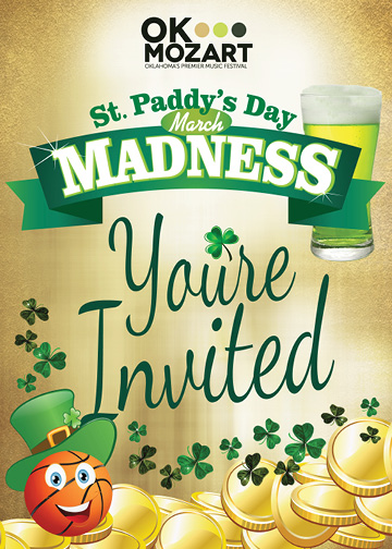
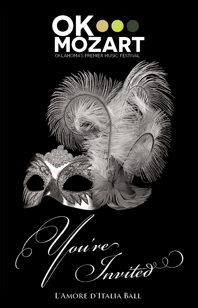
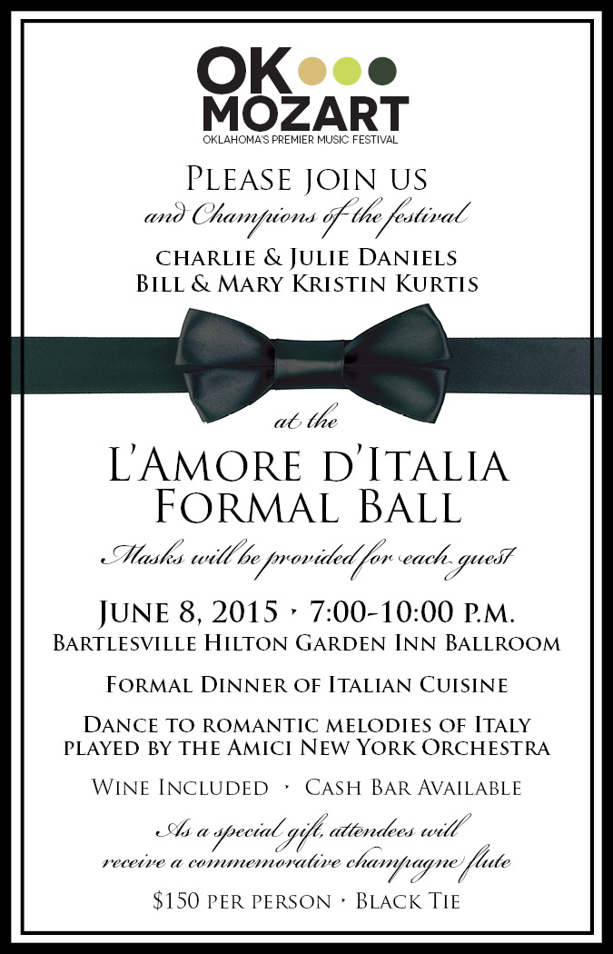
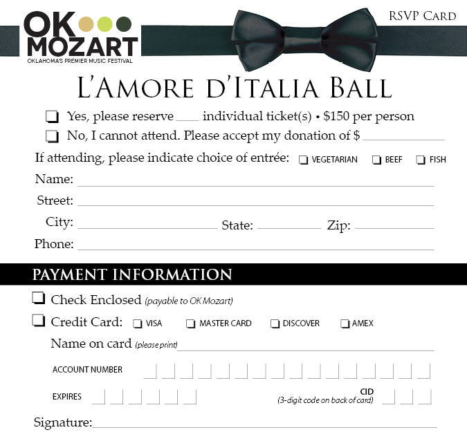
Anyway, this includes the final touches of the poster written about earlier, including one pricing change. The entire set of marketing collateral for this event for OK Mozart includes a poster, a two-sided invitation, and an RSVP card. It’s a great set! I’m not a HUGE fan of the basketball with leprechaun hat but he’s kinda cute and growing on me. I customized him out of other stock pieces and parts. One would think there would be more basketball leprechauns given March Madness’ basketball theme, no? Well, one would be wrong {insert heavy pompous sarcasm here}.