What I Designed Today: the Basics of Designing Effective, Simple Black & White Ads

Nebraska Music Dealers & Exhibitors Association – NMDEA Ads

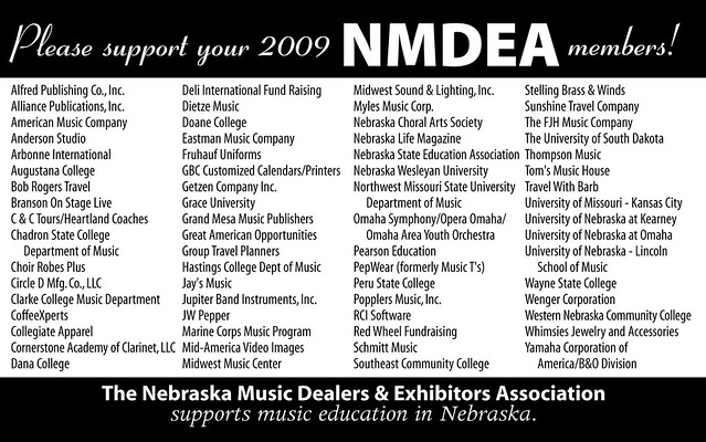
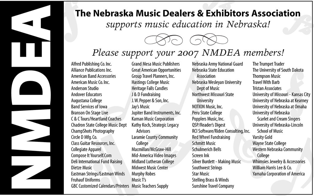
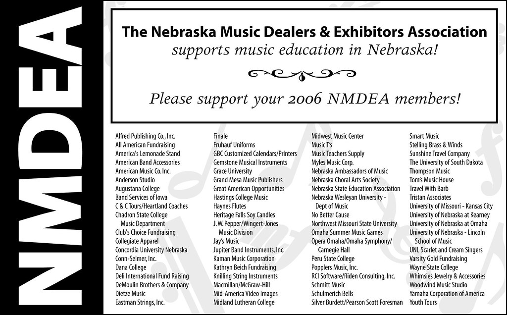
In 2006, a good friend asked me to redo the NMDEA black and white ad that had been running at their annual convention. It was a quick job so I agreed. I have now been doing their annual ad since 2006 and through two long distance moves! She approached me again this Spring for the 2012 ad and I thought it would be a good time to compile and compare past versions before I make something new. Sometimes I find an effective black and white or grayscale ad is much, much more difficult than a full color one. You have to really try to stand out from the crowd! My favorite was 2011, with the Nebraska outline used in the center. It’s funny how I can see a definite progression over the years to a better design – something I hadn’t noticed until they were side-by-side. Thanks to my friend, Marilyn, for the annual one-color challenge.

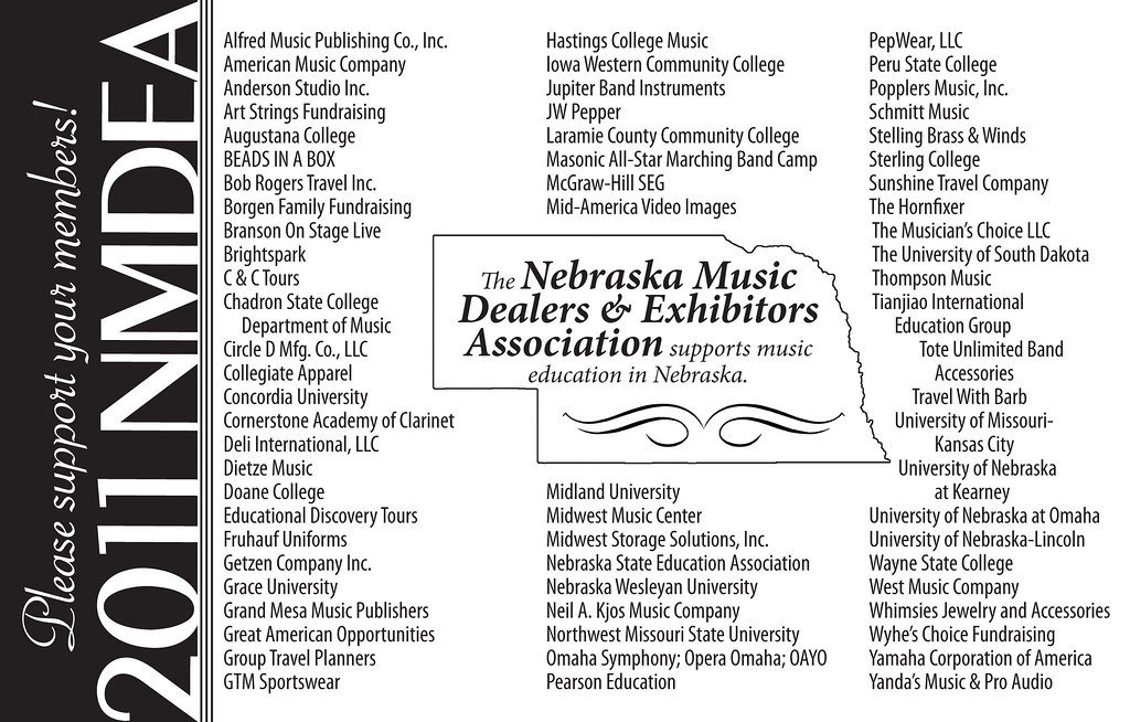
NMDEA-2011

NMDEA-2009

NMDEA-2007

NMDEA-2006

What I Designed Today: a Book Cover for Wake Up the Youth

611

Here is a book cover I did a few years ago (and finally read when I got asked to teach Old Testament to the high school sophomores this year). I highly recommend the book for anyone who teaches youth and especially love the bright green cover.

What I Designed Today: Logo Designs for Push-It Pallet

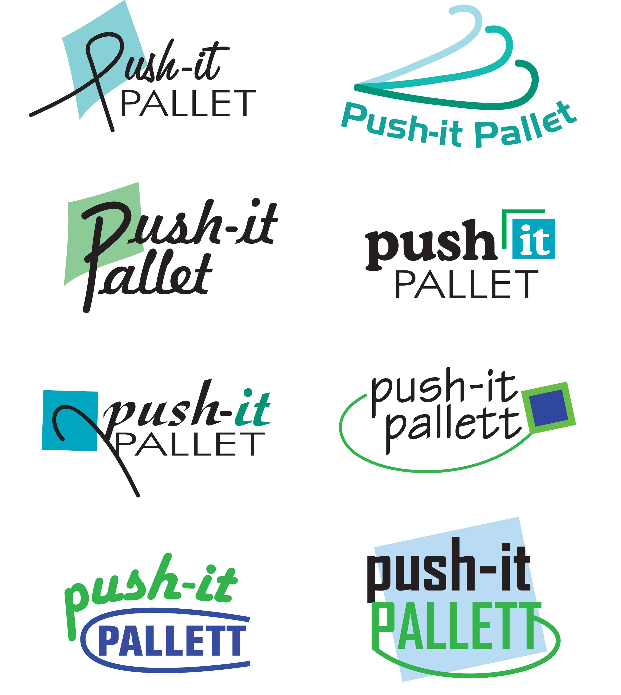
I was asked to create a logo for a company that uses padded pallets as jewelry display cases. The requirements were: blue and green colors and an arrow or “hook”. I chose to include a box to indicate more of what the company was about! I like the chosen logo because of its retro look. Here is the page of logos initially sent for review:

Here is the finished selection:

What I Designed Today: Logo Designs for Tech Learnology

Here are some quick logo samples I designed for a client in Houston. Which one is your favorite? Mine is the third from the top.

What I Designed Today: Do It Yourself Water Bottle Labels – Jesus Christ is the Living Water John 4:13-14

Print

Print

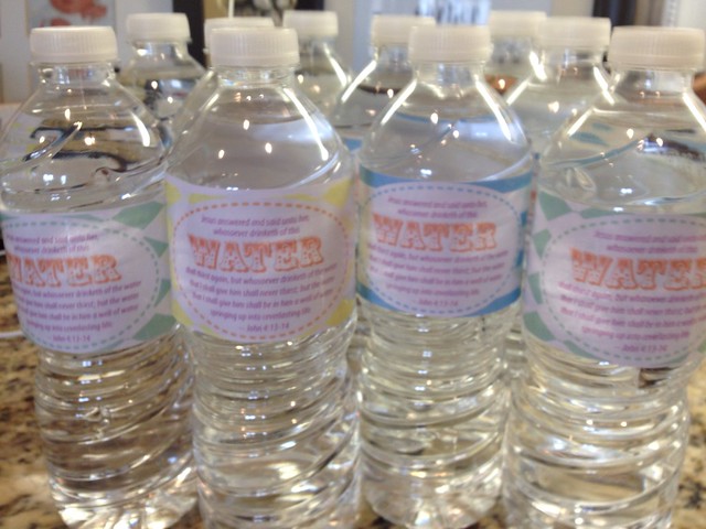
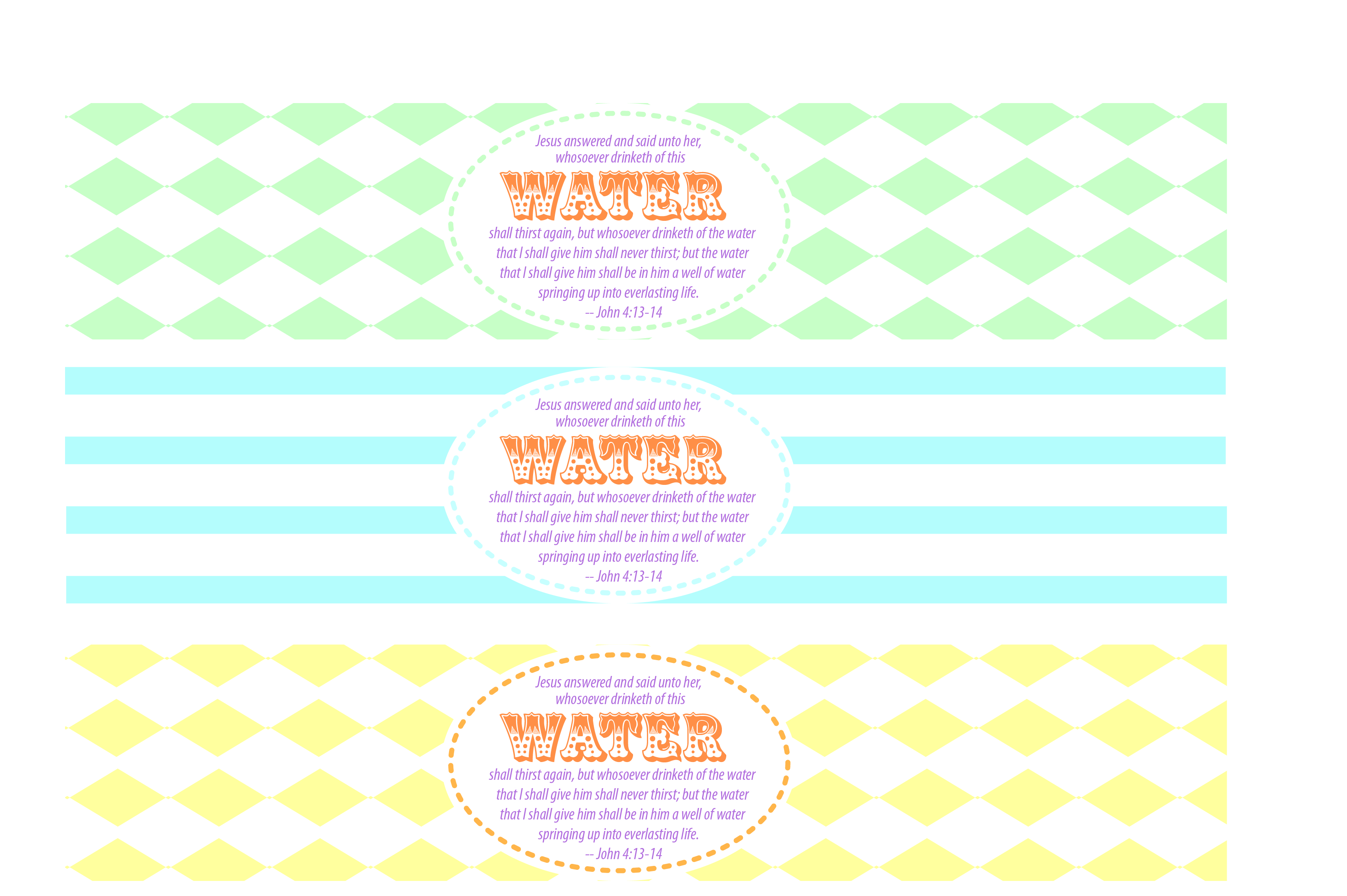
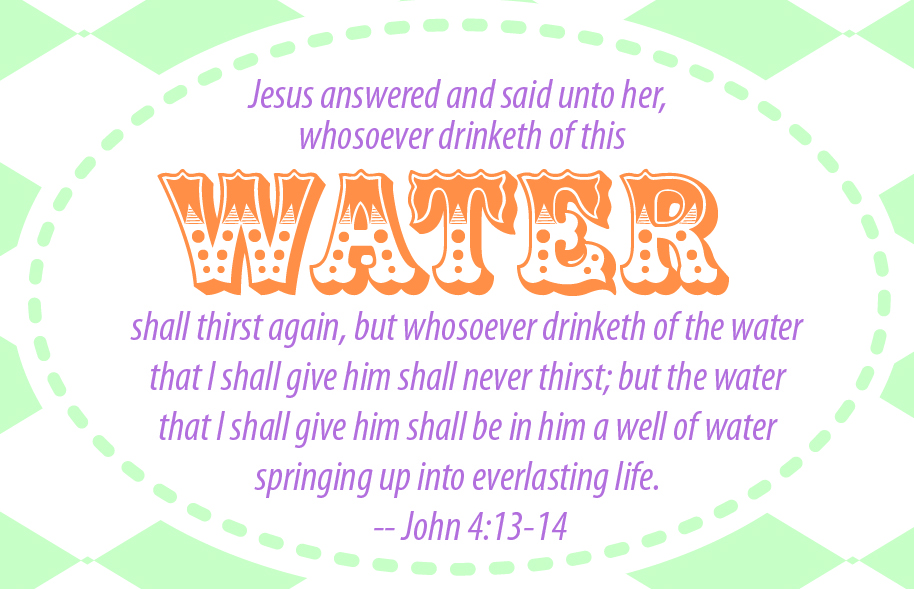
So my husband was in charge of refreshments at the youth activity this week at church and since he was helping me with a client’s custom WordPress install and website, I pitched in and helped him with the food and drink. Since I recently have been working to help a party goods designer (more announcements and info to come on that later!), I knew I could quickly throw together a water label with a fitting scripture: John 4:13-14. Free jpg file for download here. You will want to use packing tape to adhere them to the water bottle. I found the easiest way was to remove the official label off the bottle, stretch out a piece of packing tape a little longer than your new label and center it on your tape and wrap it around each bottle – voila! So cute. I think I’ll have to use this for seminary, too.

(Not So) Recent Design Work: Tradeshow Direct Mail Card for Delasco

bowfinal.PDF

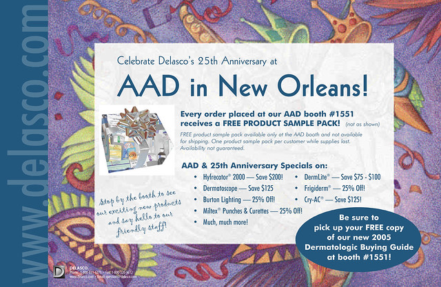
One of my freelance clients over the years has been Delasco — a fantastic company with fantastic employees. Did you know that they are the world’s largest dermatologic supplier? Not only have I done over a decade’s worth of their annual 250+ page, full-color catalog (from 1997 through 2010), I have helped them with many marketing and communications projects ranging from boxes and info sheets to forms, catalogs, ads and banners. They have been such a good client over the years that it would take hundreds – possibly thousands – of posts to show everything I’ve done for them. Some of the best moments, though, were found in developing life-long friendships with some amazing people (you know who you are!). Freelance work doesn’t have to be solitary — with clients like these, work can be uplifting and downright fun. The particular direct mailer above was used to announce their booth at an AAD meeting in New Orleans. It was a highly successful piece with a blue metallic PMS used for most of the background and the mailing side which I have yet to scan in and post.